The colours of summer that will stand the test of time
Natural shades that define contemporary design
Natural shades that define contemporary design
Every season brings new colour inspirations, but summer 2026 seems to mark a deeper shift than the simple alternation of trends. Interior design is moving away from bold contrasts and artificial palettes to rediscover authentic, material and timeless colours, capable of creating welcoming, balanced spaces full of personality.
Different interiors thus become places where wellbeing can be rediscovered, through shades that evoke natural landscapes, Mediterranean earth, stones, clays and surfaces shaped by time. Sand, terracotta, sage green, warm white and stone grey are not just aesthetic choices: they are colours that express a slower, more conscious lifestyle in harmony with nature.
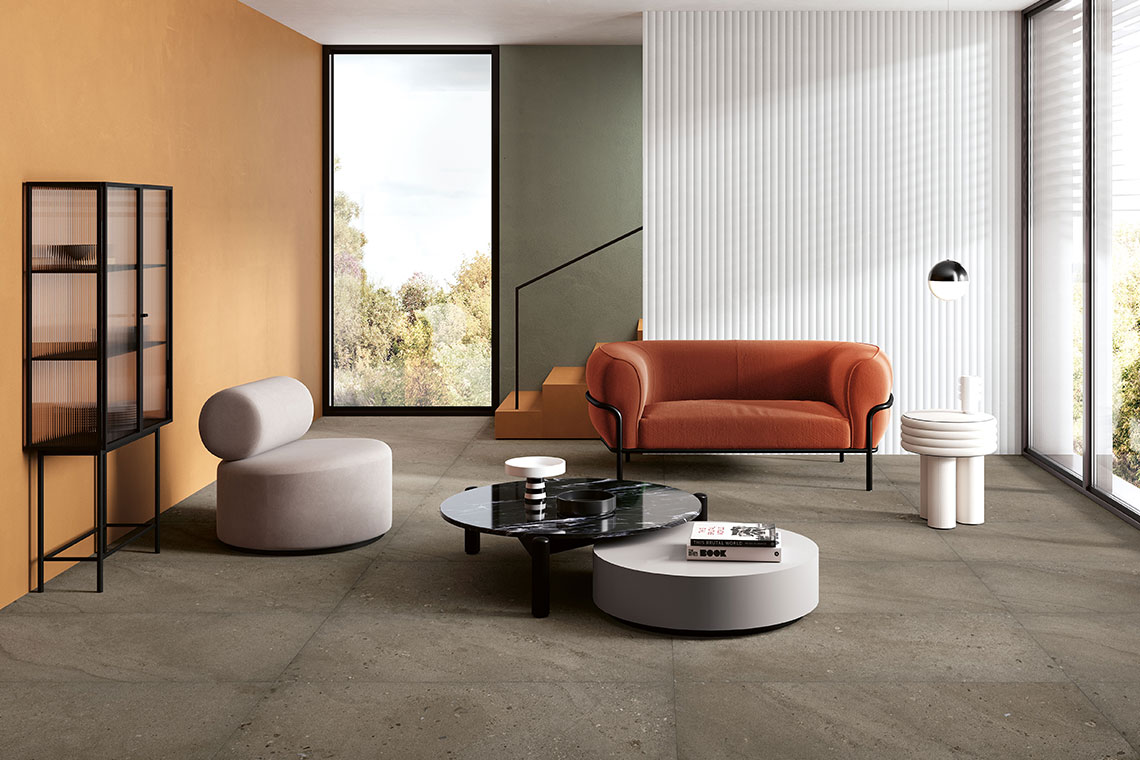
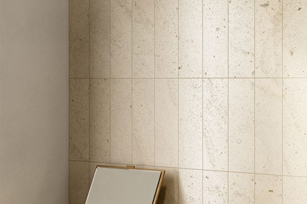
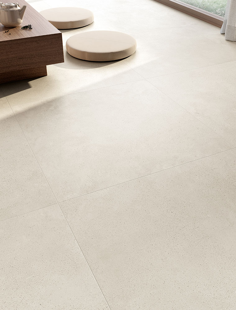
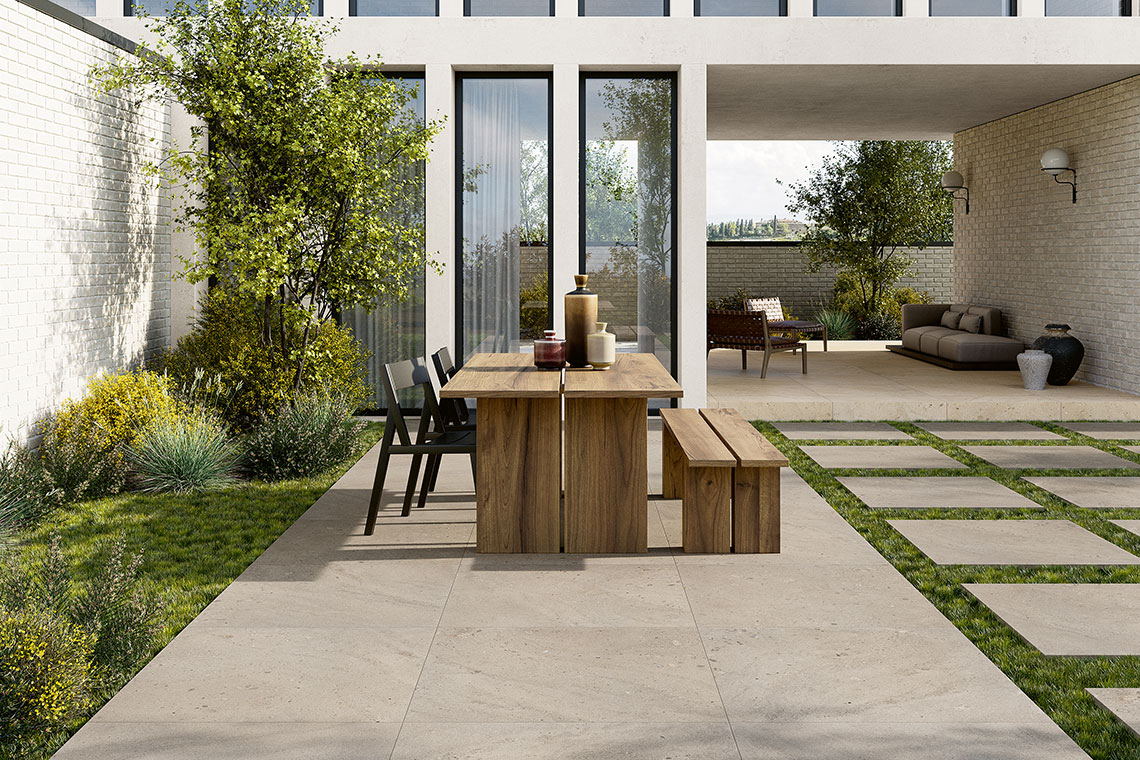
Warm, enveloping and luminous, the sand shade recalls Mediterranean beaches and the natural beauty of stone shaped by time. It is a colour that amplifies light and creates relaxing atmospheres, perfect for spaces where wellbeing takes centre stage. The I CIOTTOLI collection, for example, in the Sabbia variant, reproduces the material quality of stone smoothed by water and is particularly suited to living rooms, day areas, terraces and outdoor spaces. Here, it encourages visual continuity between indoors and outdoors, making spaces feel boundless and extremely welcoming.
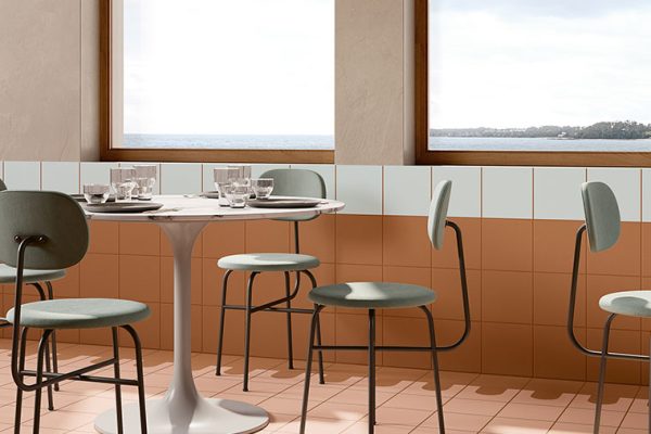
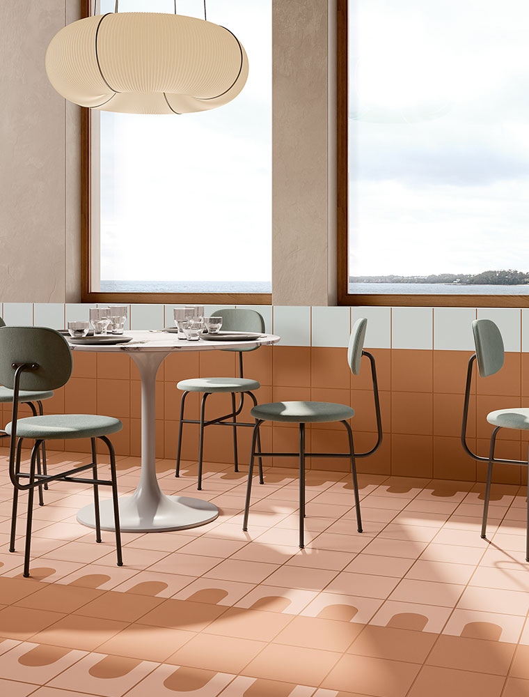
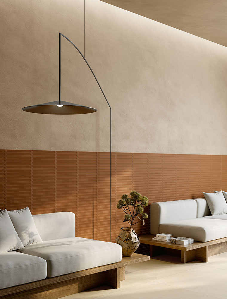
Terracotta represents a return to the nuances of the earth and Italian craftsmanship. It is a palette that brings character without ever feeling intrusive, creating welcoming spaces rich in personality. With TRATTI, for example, Fioranese proposes surfaces inspired by the handmade gesture and ceramic material, perfect for decorative walls, bathrooms, kitchens, as well as living areas where the wall covering becomes the focal point of the project.
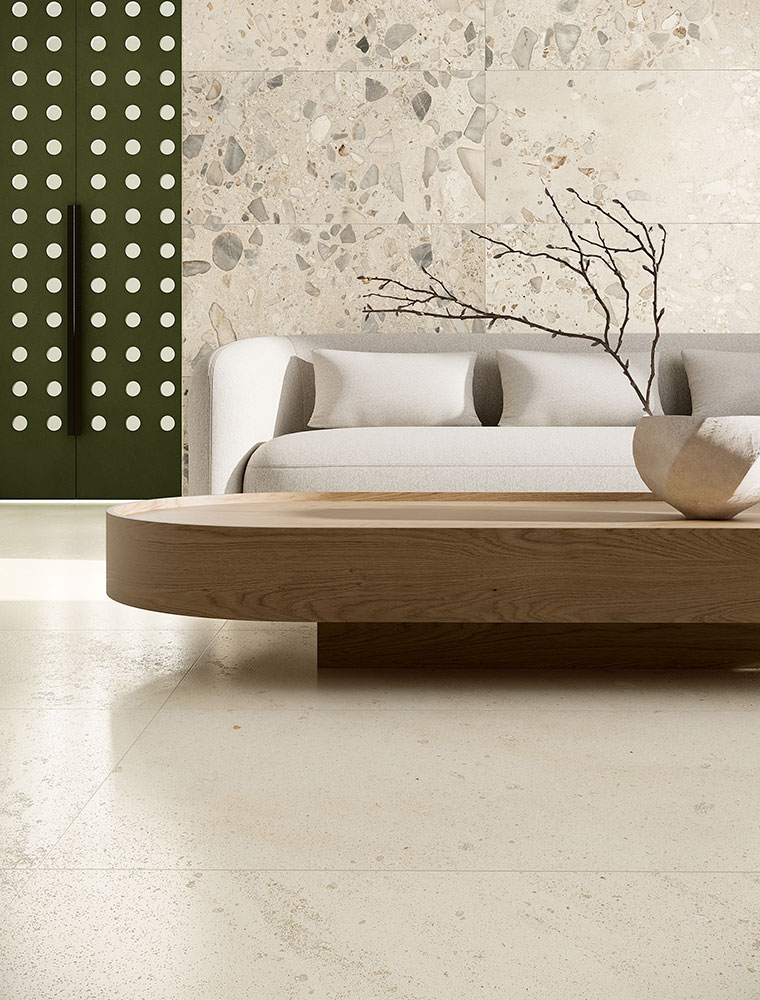
ITALIAN LANDSCAPE, on the other hand, reinterprets the colours of the Italian landscape with a more architectural language. It is ideal for spacious living and sleeping areas, where both flooring and wall coverings help create sophisticated environments with a strong scenic impact.
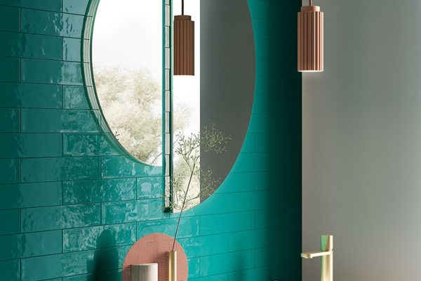
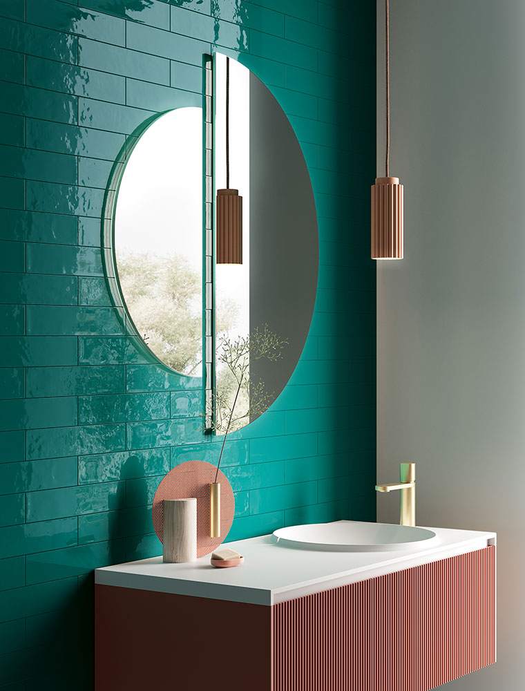
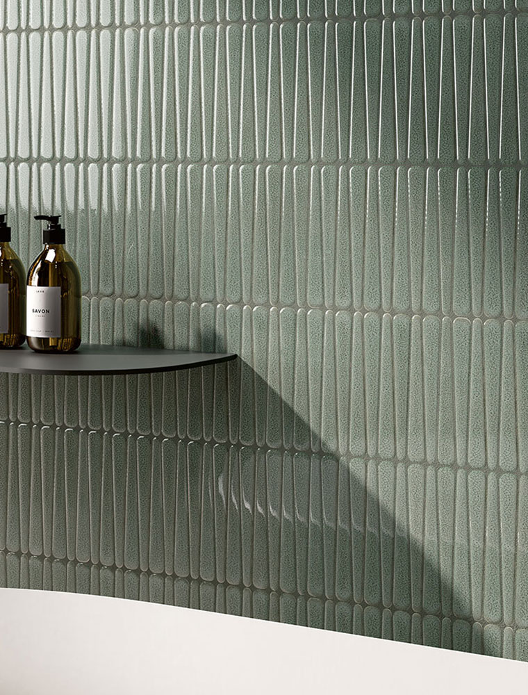
Sage green continues to conquer the world of interior design thanks to its ability to convey balance and serenity. It is a shade that recalls nature and dialogues perfectly with wood, stone and natural materials. Among the various collections, DROPS uses green with a strong decorative component, making it ideal for bathrooms, kitchens, wellness areas and reception spaces, where colour becomes the protagonist without weighing down the environment.
With FIO.GLOSSY BRICK, instead, green takes on a brighter identity thanks to the glossy finish and small formats. It is a perfect solution for contemporary kitchens, living areas and bathrooms, spaces where the wall covering adds depth and dynamism.
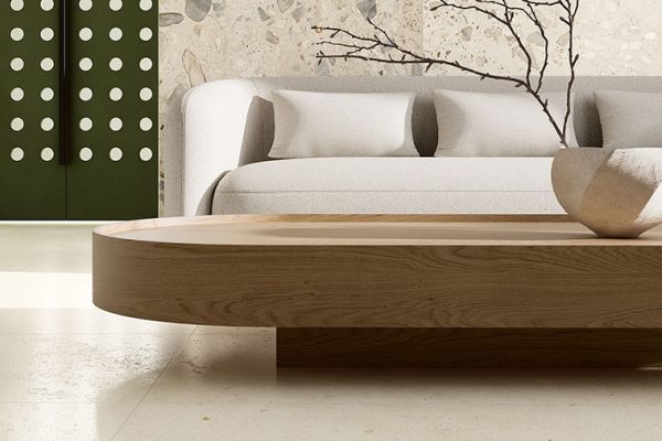
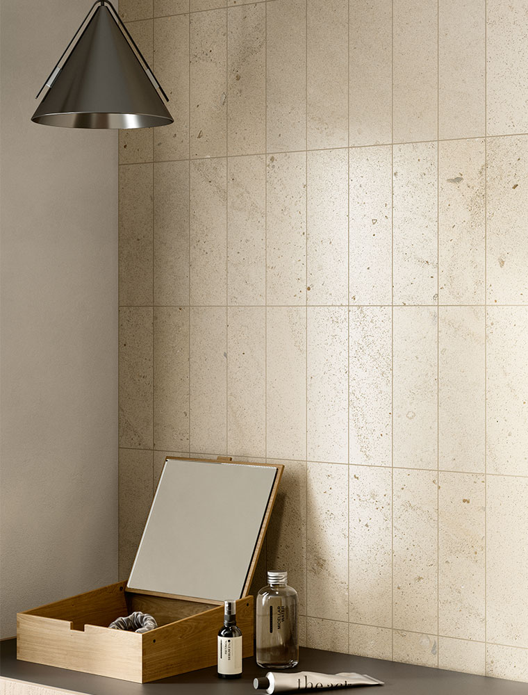
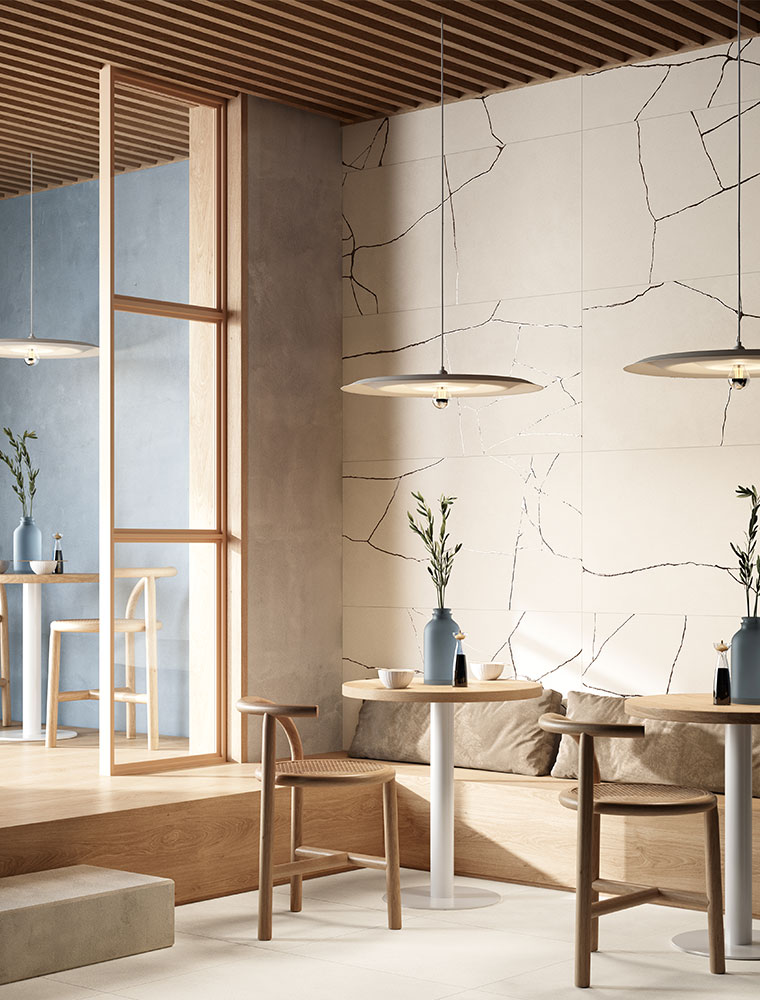
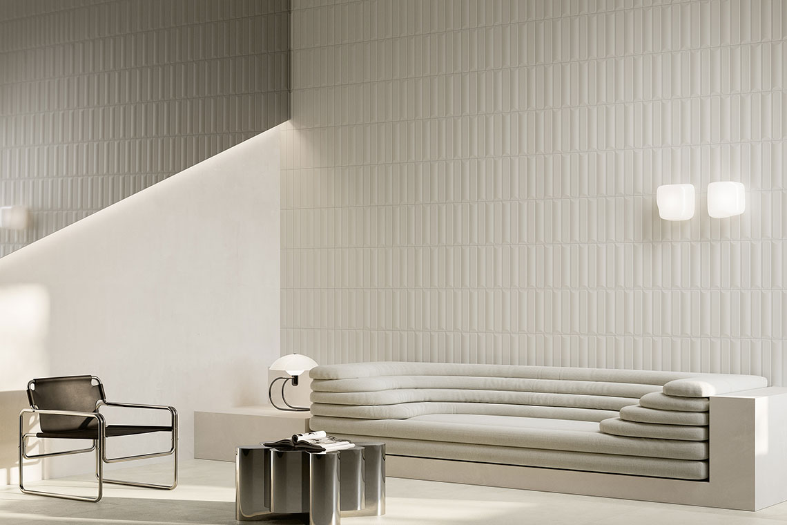
Warm white interprets a new idea of elegance: discreet, luminous and material. It is a shade that enhances architecture and leaves room for details, without ever appearing cold or impersonal. FUSION PLASTER interprets this trend with surfaces inspired by contemporary plaster, particularly suitable for open spaces, lofts and minimalist interiors, where the floor becomes an elegant and understated base.
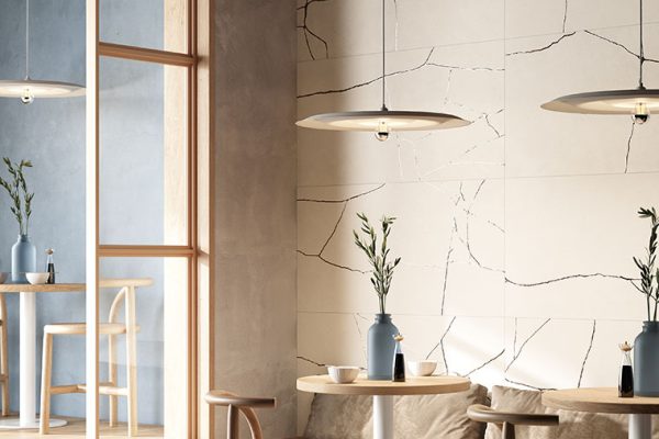
The KINTSUGI collection, instead, enriches white with delicate graphic marks inspired by the ancient Japanese technique, making it ideal for refined living rooms, hotel suites and representative spaces, where every detail contributes to defining the identity of the project.
SHARE THE ARTICLE ON YOUR SOCIAL MEDIA PROFILES: