Desire for colour, desire for optimism
New trends for projects that have a spring feel
Spring has finally arrived, together with the desire to play with colours and finishings to finally give a new look to our environments. The key is renewal and positive thinking: let’s make way for colour and original combinations that lend character to everyday spaces and create new settings for our daily lives. We’ve already talked about the colour of the year, Pantone, and how to use it, but colours for the finishings of different environments can be based on a much wider colour palette, and it’s important every now and again to remember that there are other colours apart from white.
Creating atmospheres with colour
Atmosphere is created when colours go well together and correspond to shapes, sounds and light. Harmonies change with the time; today it’s important to put colours in harmony with the lighting, whether natural or artificial. This is because lights will be increasingly protagonists in the coming years, together with design. All colours are interesting; like ingredients in cooking, the important thing is to know how to mix and use them in the right quantities, respecting the architectural dimensions and characteristics. This is true for furnishings as well as for the finishings in homes and retails spaces.
After so much white for interiors, is colour making a comeback?
Since last year we have certainly been experiencing a marked return to colours; these true protagonists in our homes have been missing since the 1980’s, and here they are again, but updated. Now we are able to appreciate many more shades. Whites, however, are not disappearing; they are becoming slightly more coloured, pink and light blue, but more intense and full colours such as red and dark blue can also be used today. The important thing is that the colour reflects our style and what we want to communicate to others, thanks to our interior design choices.

The right way to make our choice of colours
The best way to start is to observe for some days the colours that we have in the at home, and to identify those that we like the most and those that we no longer wish to see. Then colour is broken down into three variables: shade, lightness and fullness. This is the easiest way for us to integrate a shade already present or choose the one we like the most. Lightness is chosen on the basis of the quantity of light of the room and the light that arrives on the surface to be coloured. Then the type of finishing and the final desired effect are decided upon.
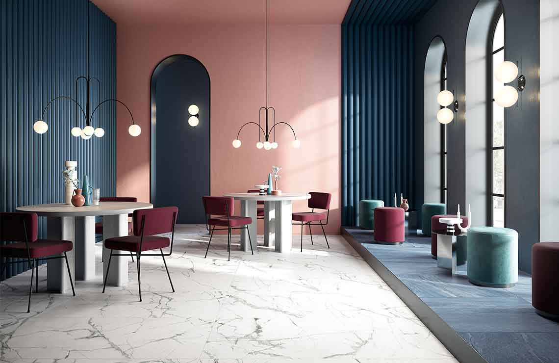
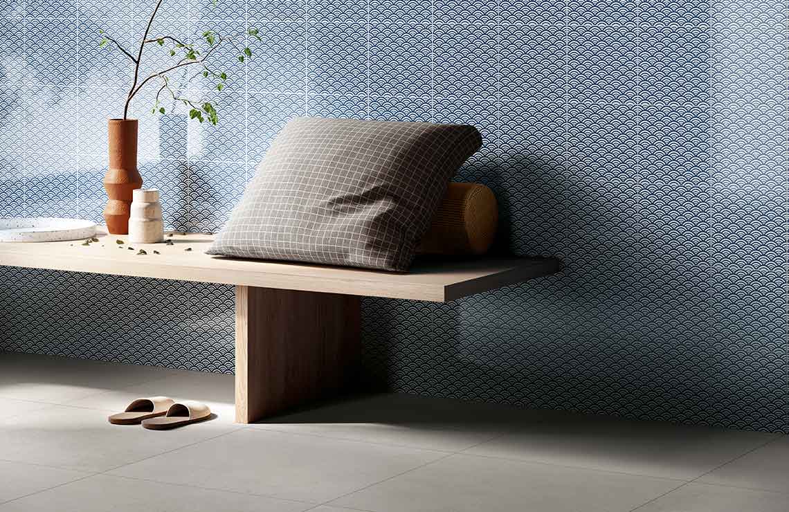
Redesigning spaces in the home with colour
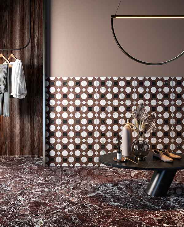
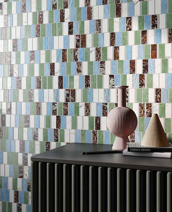
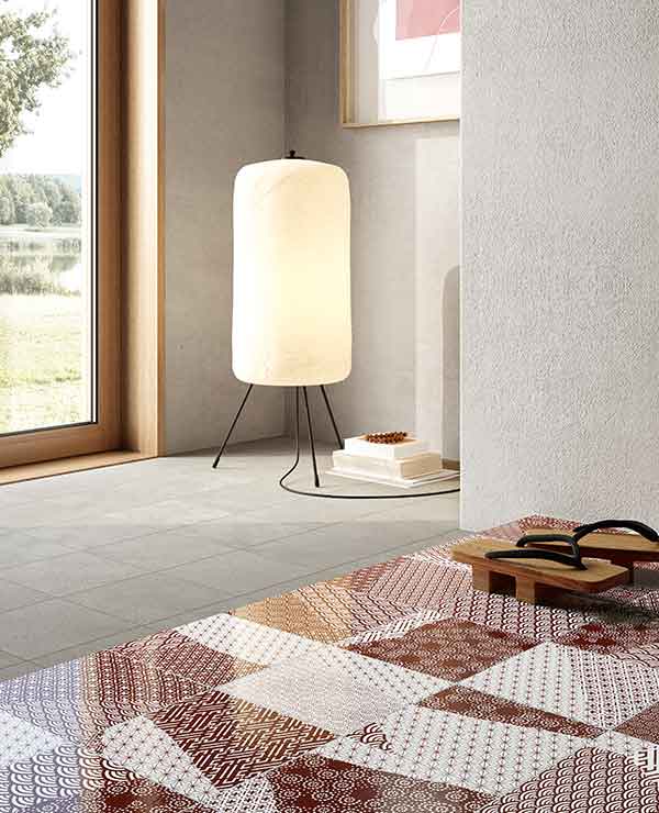
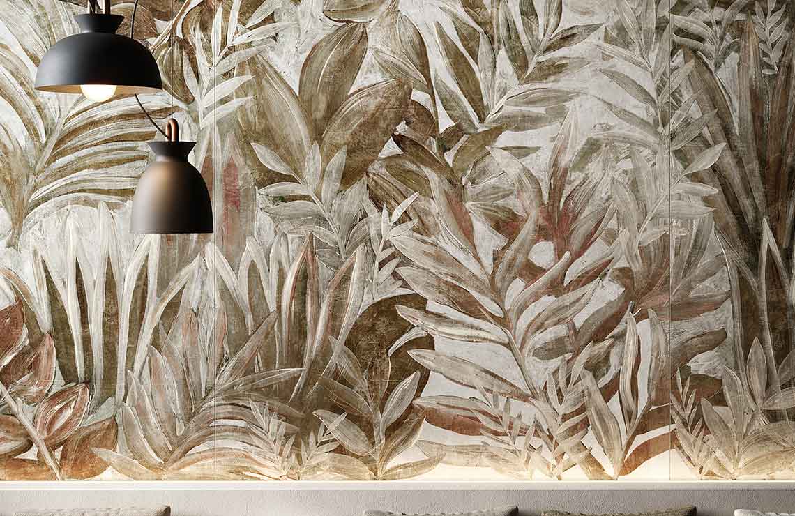
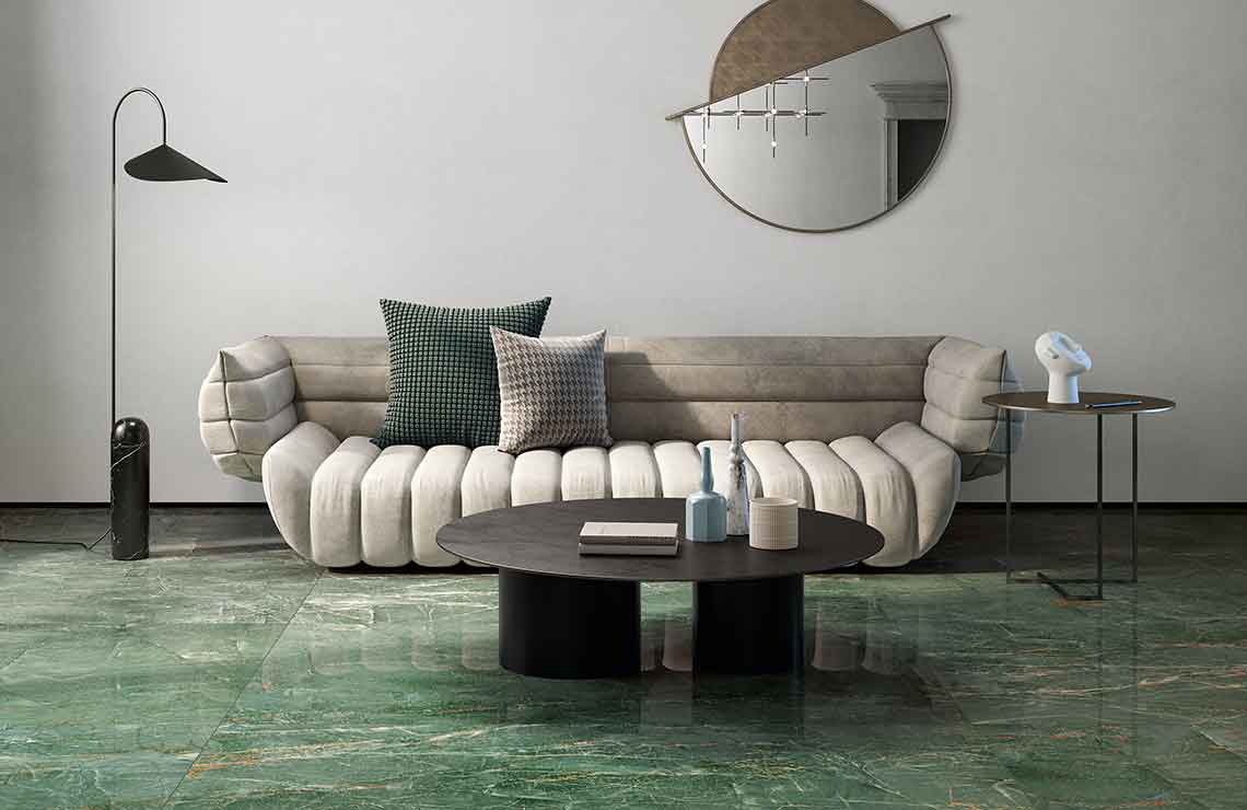
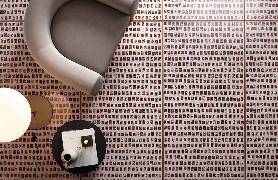
Fioranese offers various different collections by style and colour choice that make it possible to express our creativity to the full and model spaces as we like best, thanks to really unique finishings. Intense or more subtle nuances, botanical or graphic decorations, numerous inspirations that Fioranese offers us so that we can begin to rethink our environments also in terms of colour. We want to take a closer look at the more graphic and striking collections. It’s impossible not to refer to Marmorea Intensa, which offers an impressive range of colours and precious yet contemporary marble-effect finishings. It’s impossible not to be enchanted by the sheer luminosity of the green and light blue, together with the depth of the red that this collection offers in the different variants. Culture and classicism, technology and innovation together create really intense and unique shiny and matt decorative effects. A finishing can also be used to highlight a space, furnishing it with its own graphic effects. This is what the Fio.Clorofilla collection does, bringing to spaces designs full of intense and brilliant green, but also hints of grey and brown in a series of nuances that perfectly recall the Biophilic Design macro trend and the colours of nature. Finally, we want to refer to what is perhaps the most striking collection proposed for 2021, composed of an ensemble of formidable colours: Kintsugi. Japanese culture, made up of timeless elegance, here offers warm colours, some in geometric combinations, truly original for a stoneware collection. It’s a line of tiles where colour becomes truly precious, as far as taking on the tones of gold, red and ochre, creating together an overall effect made of grace and harmony.
Choose your colours calmly – they need time…
SHARE THE ARTICLE ON YOUR SOCIAL MEDIA PROFILES:
