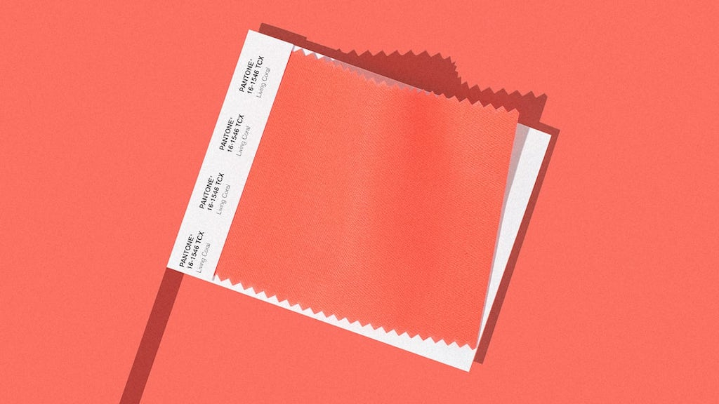
The Pantone colour for 2019? Living Coral
A warm, vibrant colour, dedicated to the environment and the protection of the coral reefs
The Pantone Colour of the Year for 2019 is Living Coral, a lively coral shade with a golden nuance. A playful, yet relaxed shade that transmits joie-de-vivre and a desire for human contact and a connection with nature, as a reaction against the spread of digital technology. A positive message in a continually evolving world, and also an invitation to pay heed to the risk to our coral reefs.
How the Colour of the Year is chosen
Every year, the announcement from the Pantone Color Institute is eagerly awaited. The search for the colour of the year lasts about nine months, during which the institute’s team sets off in search of models or colours that recur in everyday situations. The colour of the year, as they explain, is a colour snapshot of what we see happening in our global culture, and it’s necessary to express a mood, a general attitude. For the occasion, Pantone has placed a limited-edition colour palette on sale dedicated to “Living Coral”, as well as a number of products including a cup and a USB pen drive.
What Living Coral symbolises
The official name of the colour is Living Coral Pantone 16-1546. The numbers refer to the level of luminosity, tone and colour on various scales. But one thing is certain: when we go shopping we’ll simply be calling it “coral”. This is a bright, engaging colour that works in every field: it’s suitable for design and for the beauty sector, where coral nail enamels and lipsticks have always been a must. Coral is also one of the most sought-after colours of the new iPhone, while the fashion world for the coming spring/summer will see a powerful return of orange shades. During fashion week in September, coral was featured in many items by the likes of Marc Jacobs, Chanel, Versace and Burberry.
Living Coral, a dash of colour for home decor
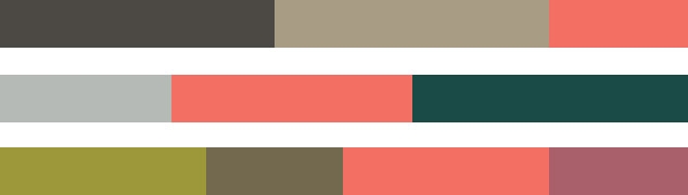
As regards home decor, since Living Coral is a warm, vibrant shade of orange tending towards peach, it can be used in many ways and combinations. There are plenty of different colour palettes it can be combined with; the Pantone Color Institute suggests some highly original pairings, which can be directly consulted on the website. Living Coral can certainly be used to add “a dash of colour”, and you might like to choose some distinctive accessories, such as those created by Normann Copenhagen, which is already selling some occasional tables and cushions in Living Coral, or you might decide to paint an entire wall in a room, to subtly highlight some particular architectural features.
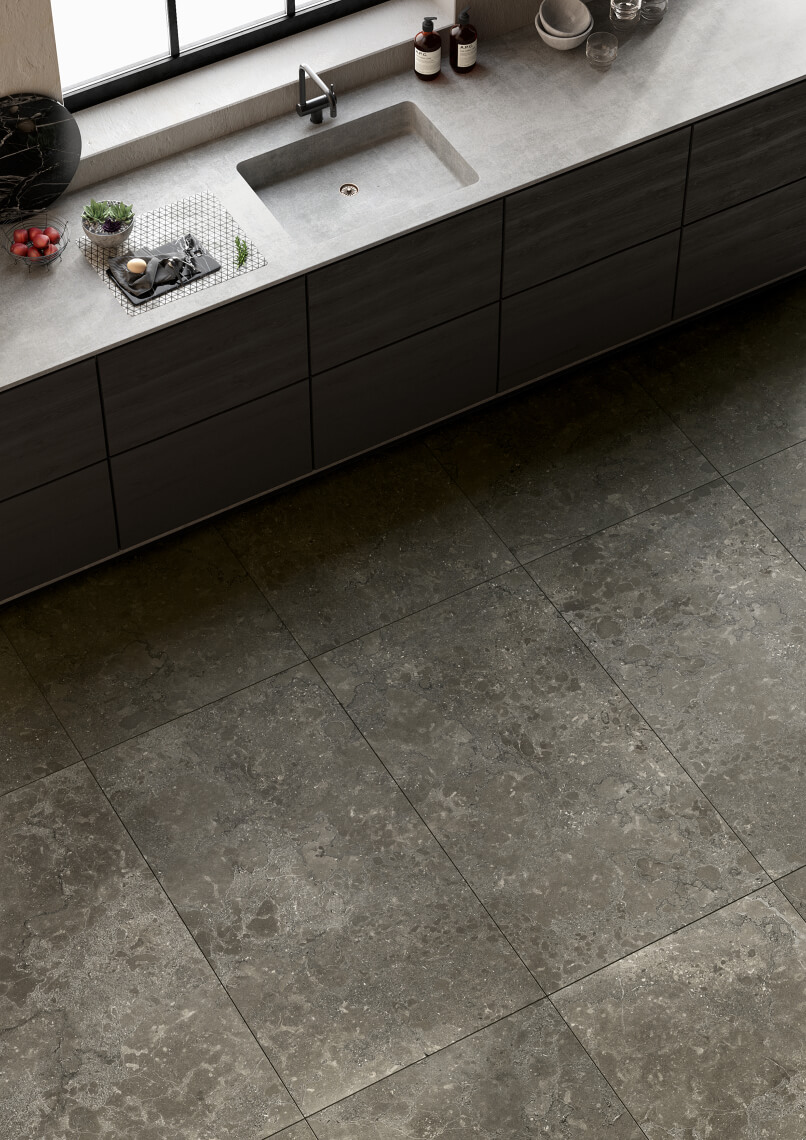
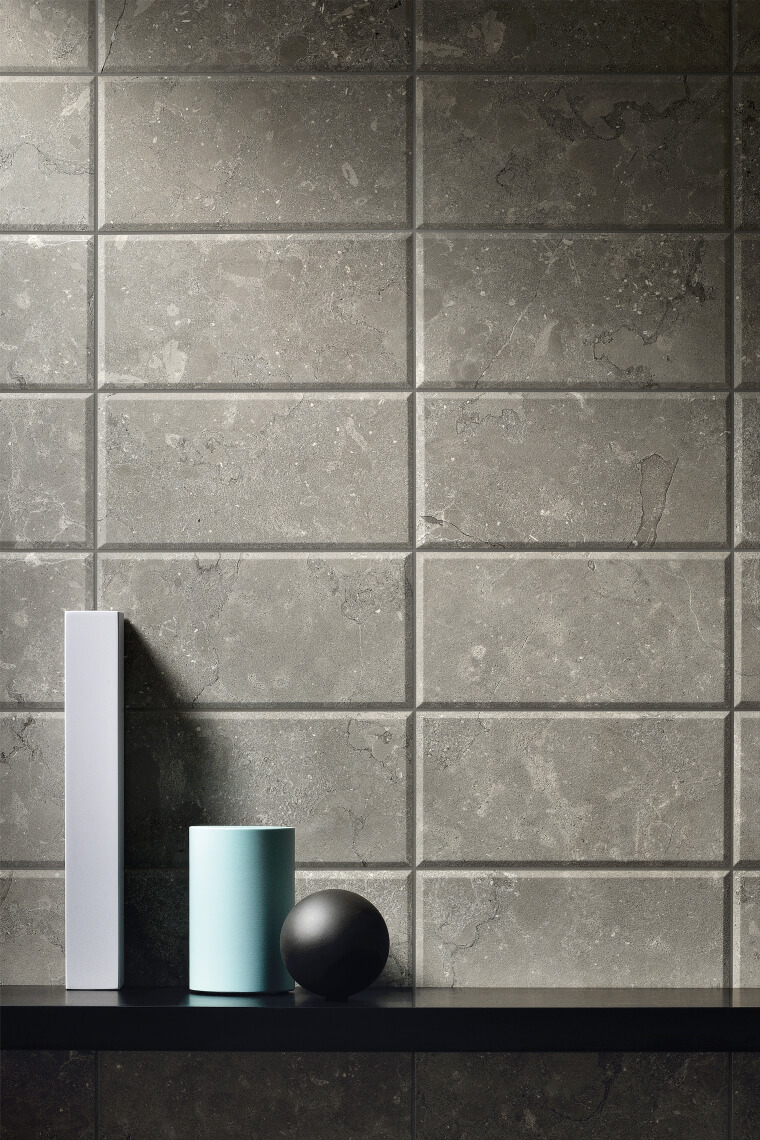
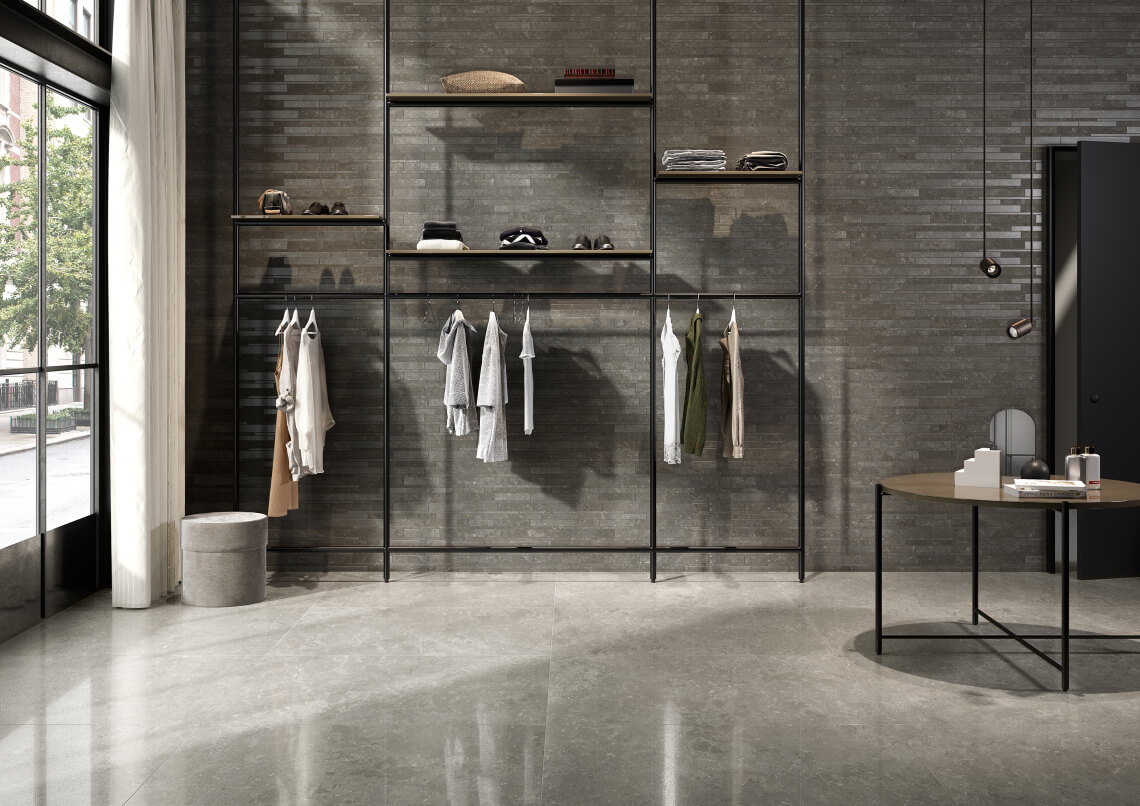
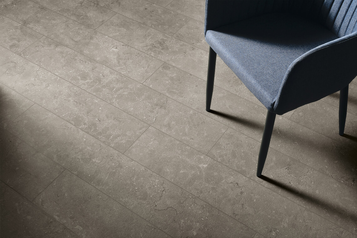
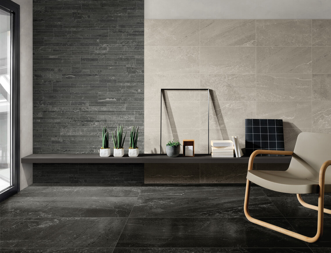
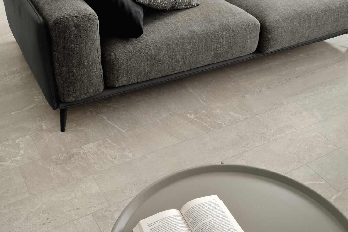
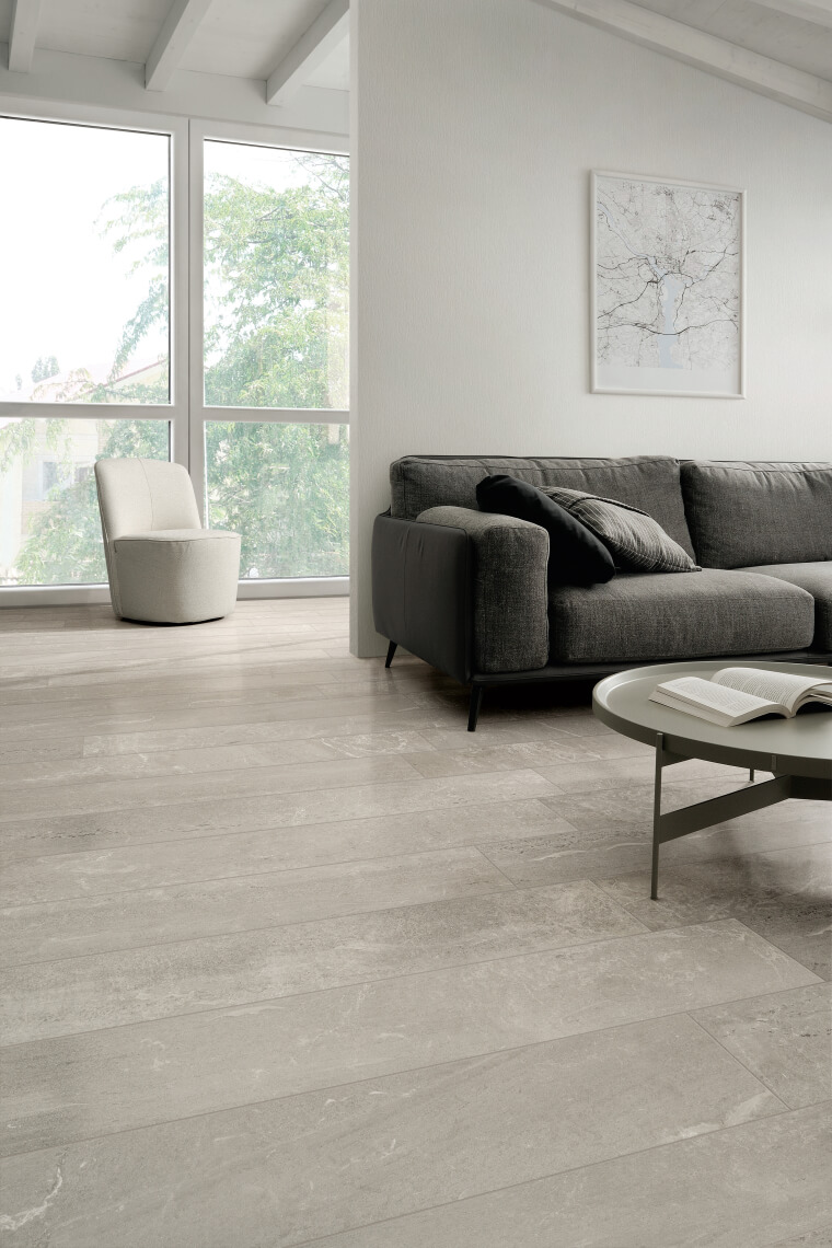
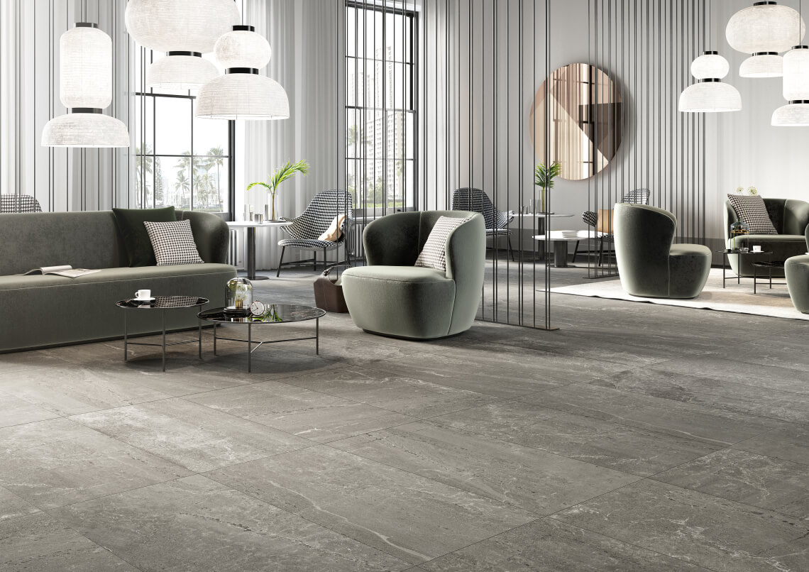
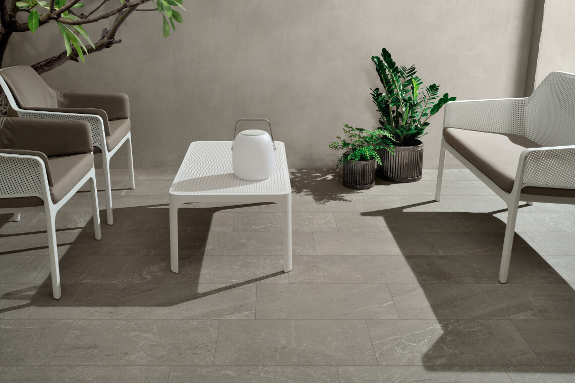
Which covering materials can be used to create harmony with Living Coral?
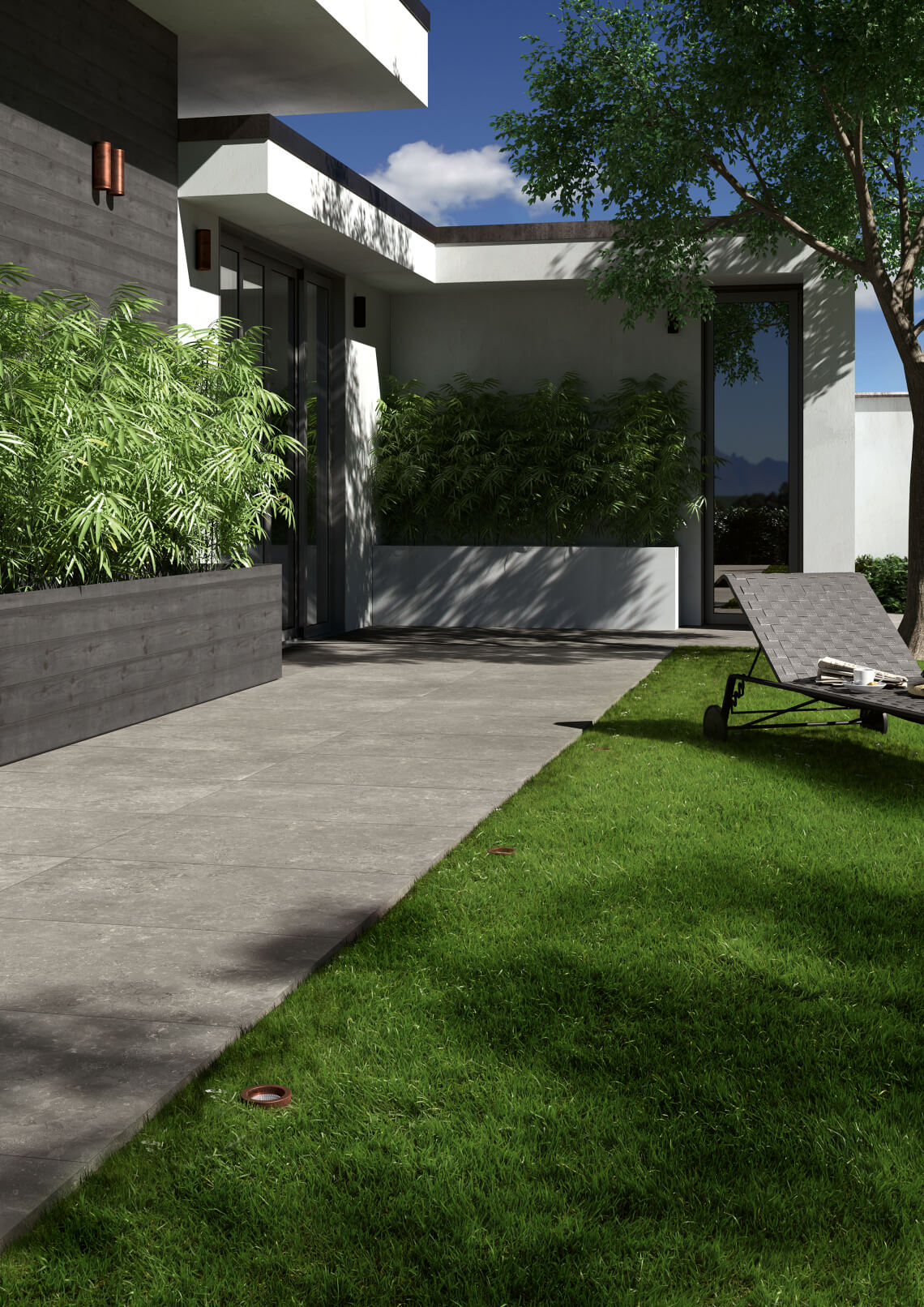
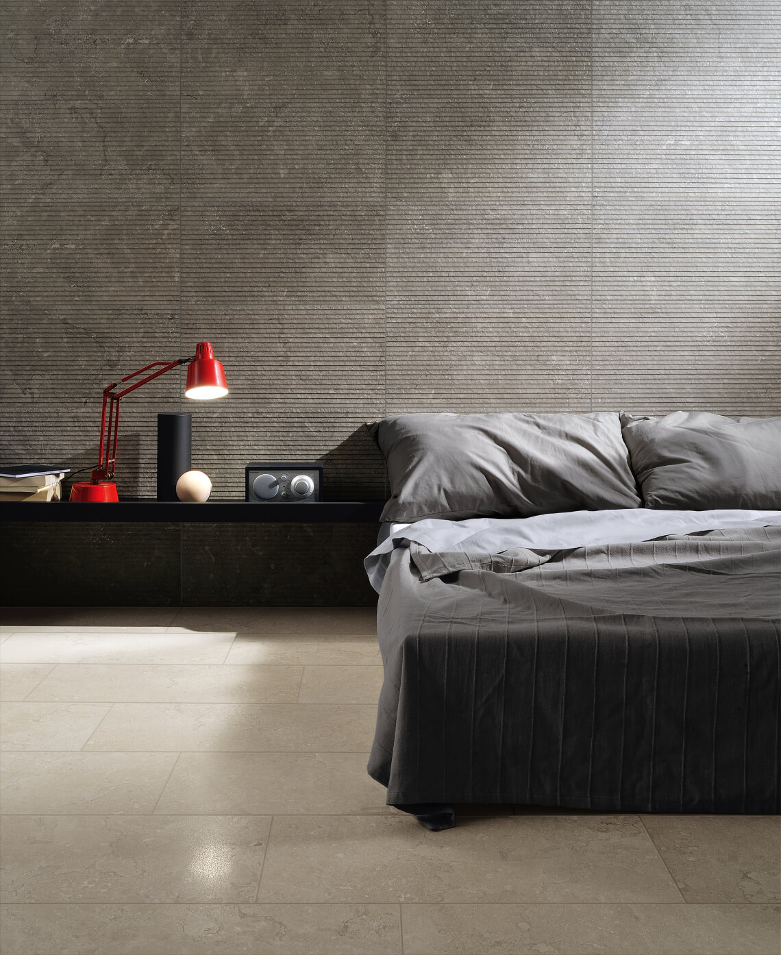
To make the most of these new elements in Living Coral, it’s particularly important to combine them with very natural finishes, featuring stone, for example, especially in darker shades. Ceramiche Coem offers collections with a neutral, material flavour, designed to enhance settings by creating just the right backdrop for striking furnishings, even with distinctive shades such as Living Coral. The Blendstone and Lagos collections in stone-effect porcelain stoneware are ideal options for creating smooth ambiences that are prefect for hosting elements in Living Coral, be they walls or special furnishing items. The Lagos collection, inspired by a limestone rock present in nature in a variety of colours, offers shades from light through to dark grey, bringing an intense allure to settings, while the minimal, linear mood of the Blendstone collection features a skilful mix of patterns taken from marble, Burlington stone and worn surfaces with nuances that range from light grey to darker graphite. Both these collections seem to have been created with the Pantone 16-1546 colour in mind. Blendstone, Lagos and Living Coral: the perfect mix for home decor in 2019.
SHARE THE ARTICLE ON YOUR SOCIAL MEDIA PROFILES:
