Davide Tonelli presents the new Liquida collection
A contemporary edge for the Fifties look, ready to bring a touch of colour
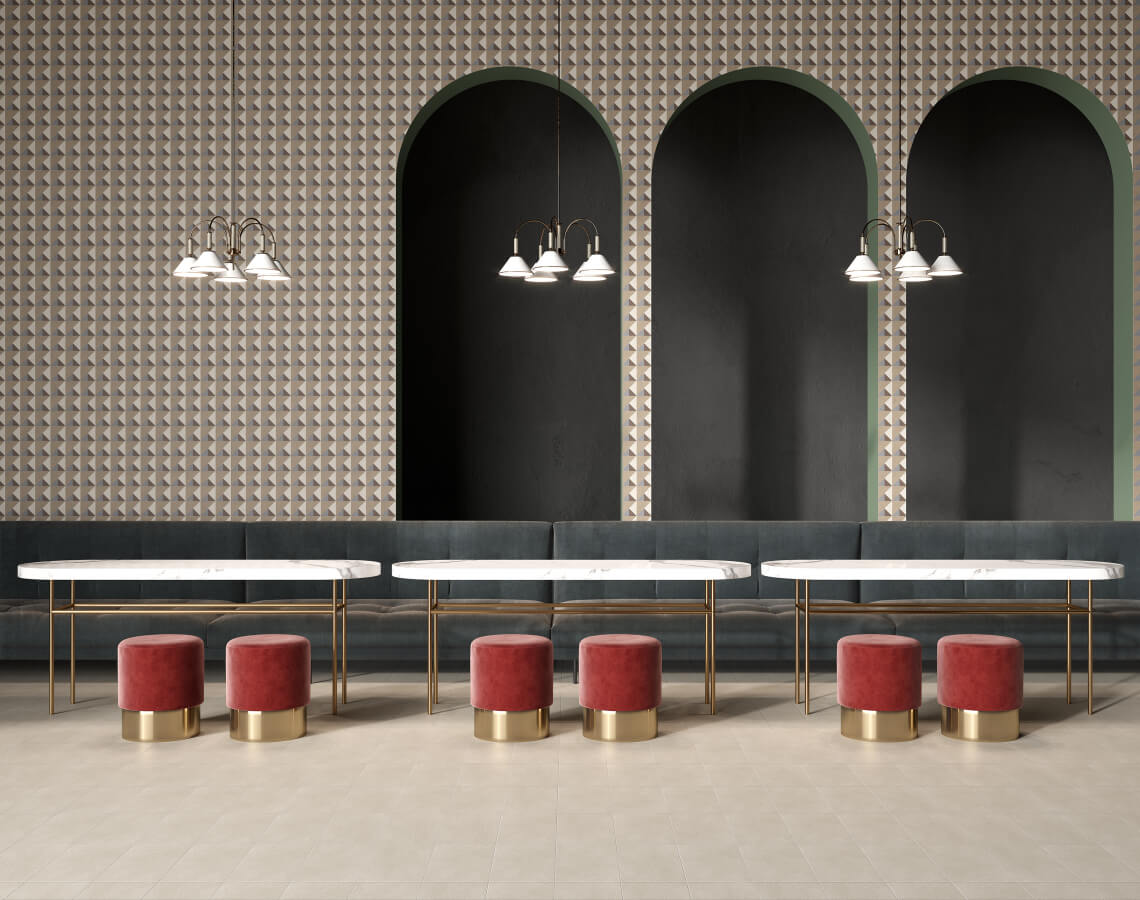
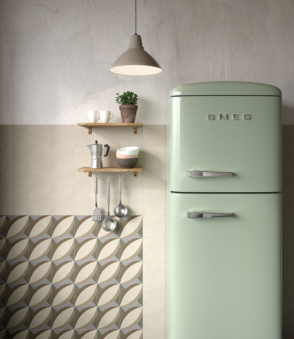
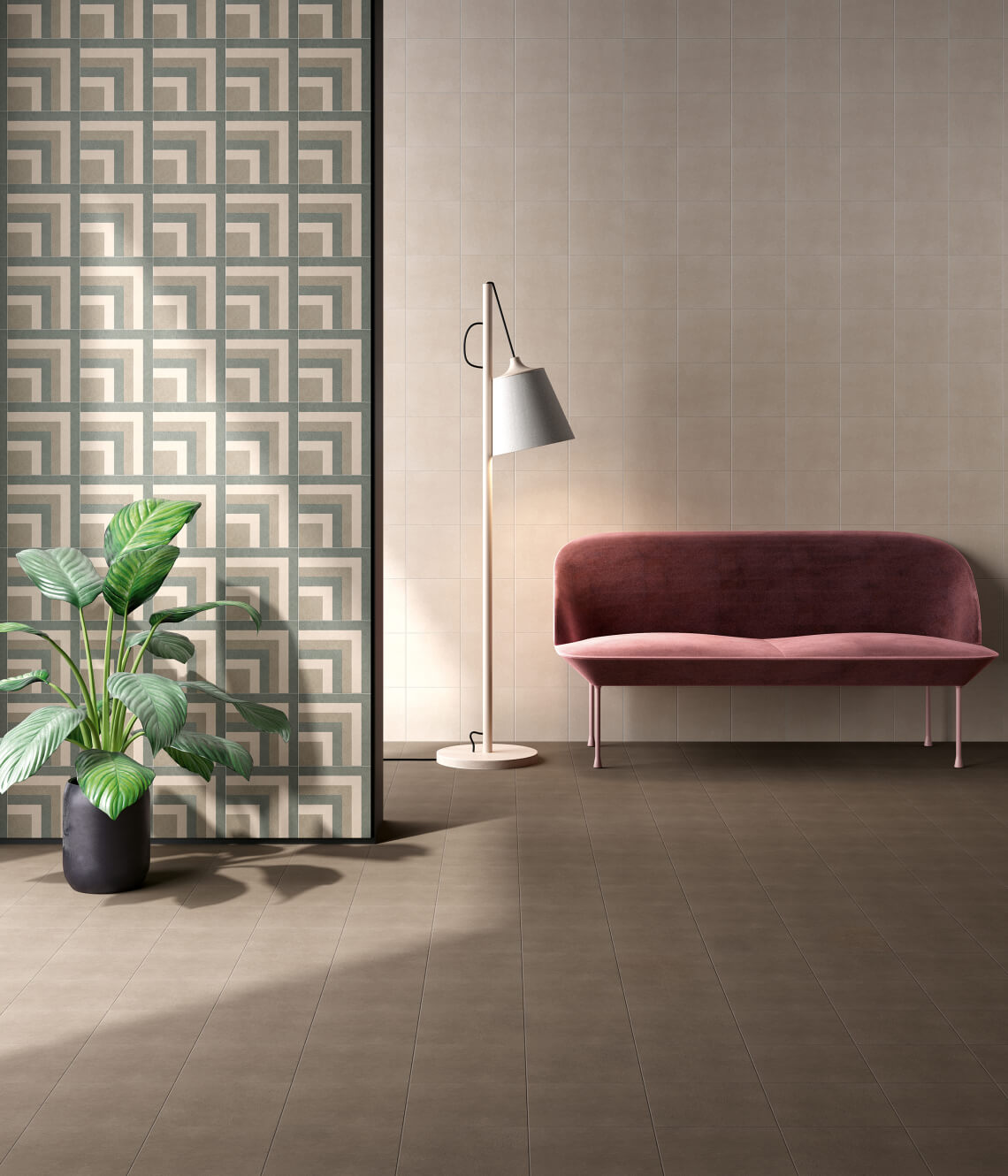
During the latest edition of Cersaie, Ceramica Fioranese presented the highly original new “Liquida” collection, a project by Davide Tonelli, whose aim was to bring a new, modern, sophisticated, cheerful edge to the vintage trends of the 1950s. Liquida, which proved immediately popular with the public, comes in six distinctive new pastel shades – ivory, dove grey, pink, sage green, powder blue and cocoa – that bring an eclectic, striking allure to the porcelain stoneware. The eight patterns complete the collection, bringing an even more contemporary slant to the project, suitable for both traditional residential and commercial settings. Nestled in this engaging, magical world, we interviewed Davide Tonelli to find out more about the origins of Liquida and where the inspiration came for such a modern, distinctive collection.

– This isn’t the first time you’ve worked for Fioranese. Tell us how this relationship began.
One day I got a call from Fioranese, a company I’d always been very taken with for its creative approach to surfaces, its ability to treat them in a dynamic, original way that also reflects my way of working. These are the common values underlying our relationship, which this year has yielded two new collections, Liquida & Passepartout, which use digital printing and material to seek a perfect balance between the patterns of the 1950s and today’s technological innovation.
– The series you’ve designed this year for Fioranese is called LIQUIDA. How did you come up with the name?
I imagined the living scenario and the lifestyle of the new generations, a new model of living spaces that’s “liquid”, fluid, able to capture the new sociological needs of co-living and sharing by offering original patterns and colour combinations that closely reflect the personalities of these “new consumers” seeking to bring about innovation and not just sit and wait for it to happen.
– Where did you get the inspiration for choosing the decor elements and the colours in this collection?
Focusing on the shades of the Millennial Pink we’re all familiar with by now, a powerfully engaging trend that works right across the board, from clothing to interiors, the idea was to build a range of shades around it, varying from dove grey through green and blue to brown, able to interact with it. Teaming the past with the future: we might say this is the colour that’s become the symbol of the new generations – not frivolous, but nomadic and extremely fluid.
– How important is the choice of covering materials to bring character to a setting?
It’s decisive to give a strong identity to a setting. Decoration once again has a key role to play in bringing a distinctive connotation in this digital era characterised by solutions that boast extremely high quality, but that are often “anonymous”, excessively seeking a photo-realistic imitation of stone, marble or other natural elements. I believe that new shapes and new uses of colour in interior decoration should provide some initial food for thought, allowing us to take back our identity and move away from this increasing standardisation.
– What made you look to the Fifties for inspiration? How did this decade characterise interior design?
The Past continues to fascinate us. “Respecting” it, by giving it a more modern edge, is, I believe, one of the most interesting challenges for anyone in product development, whether we’re talking about ceramics or any other sector. The Fifties have very much left their mark in terms of shapes and colours; it was one of the most creative periods in history, despite not being supported by any particular technologies. The eccentric colour combinations of that period, compared to the present, can be considered equivalent to a kind of retro minimalism.
– Which artist or school of design has had the greatest influence on your work?
There’s no one particular source of inspiration in my work; there’s observation, curiosity, influences from all that surrounds us: reading, travelling, music, experiences – life, if you will. It’s something that’s always there in the background, and you try to take opportunities from it to turn it into something different, something appropriate, picking up on new needs that emerge.
– Three design objects that are a must for you?
Seats, in contrast or in harmony with the space around them. Lamps, which have a key role in creating an atmosphere. Coffee tables, a structural element that takes on a decorative role.
Curious? Ready to explore the contemporary world of the Fifties? You’ll love Liquida & Passepartout and their pastel colours and patterns. See them all at https://www.fioranese.it/en/floor-and-wall-tiles/fio/
SHARE THE ARTICLE ON YOUR SOCIAL MEDIA PROFILES: