How to create designer interiors thanks to finishes, textures and colours
Ceramica Fioranese presents “Cross over with Style” at Cersaie 2018
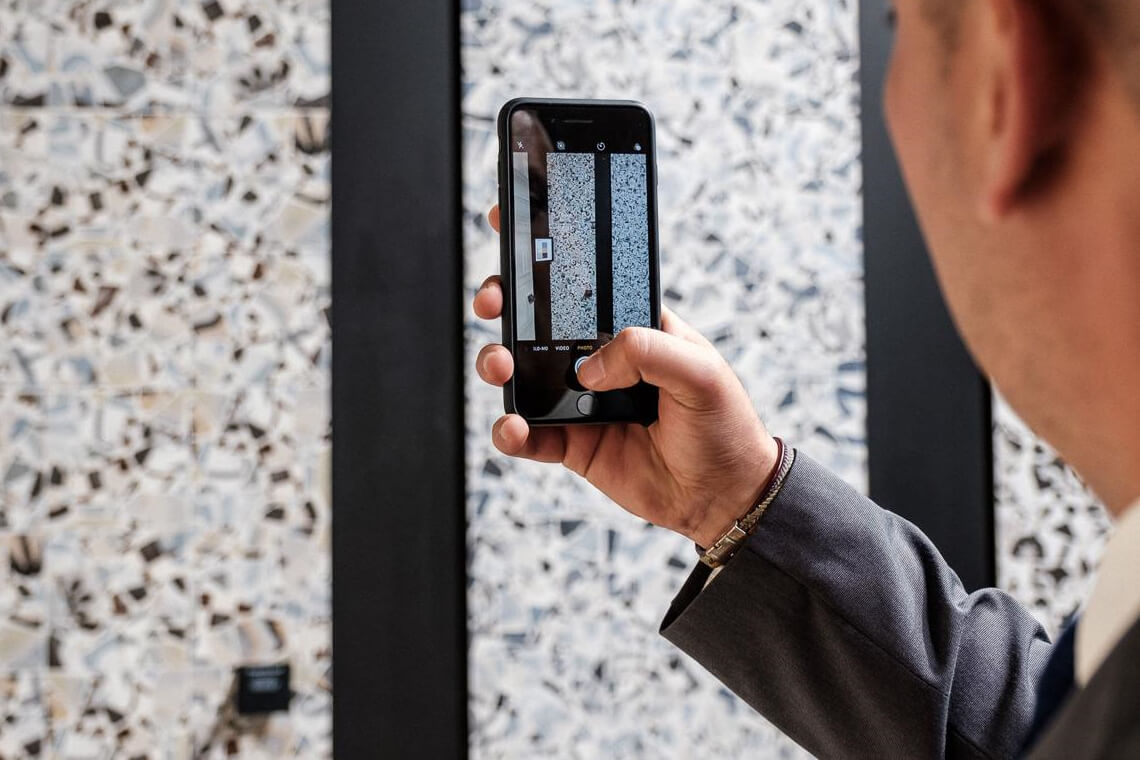
Freedom to express yourself, freedom to be creative, whenever and wherever, also choosing particular and original finishes for personalizing the environments we live in every day. This is what we experienced visiting the Ceramica Fioranese area at Cersaie in Bologna, a great feeling of freedom with the possibility of being able to choose from numerous different and particular collections with a mix of distinct and balanced styles, which reinterpret classic tastes in a contemporary approach. With “Cross over with Style”, Fioranese’s theme for this Cersaie, the company has chosen to present new surfaces and finishes suitable for furnishing spaces with boldness, without precise architectural limits, skilfully mixing creativity, colours and different materials. The new collections in Ceramica Fioranese porcelain stoneware perfectly interpret a multiplicity of different material effects, from concrete to stone, from wood to marble, selecting textures that draw inspiration from tradition and designer quality. The new collections make it possible to personalize home interiors with finishes that perfectly reproduce the tactile and visual characteristics of the original materials, maintaining the performance features of ceramics so as to obtain intriguing and resistant porcelain stoneware floorings. We encountered sophisticated atmospheres and refined designer pieces when we entered the amazing area set up by Ceramica Fioranese. We were won over by the particular colours and unique finishes, by the original combinations between materials and formats, able to create new and contemporary ideas with great attention to detail. Time after time it was easy to imagine living in such special atmospheres and fall in love with the new collections: are you curious to discover them with us? Here we present the new ideas of Ceramica Fioranese which struck us the most at the “International Exhibition of Ceramic Tile and Bathroom Furnishings” (Cersaie): Here they are!
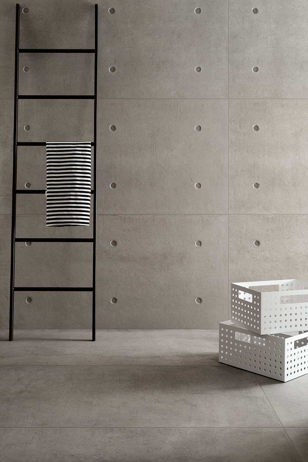
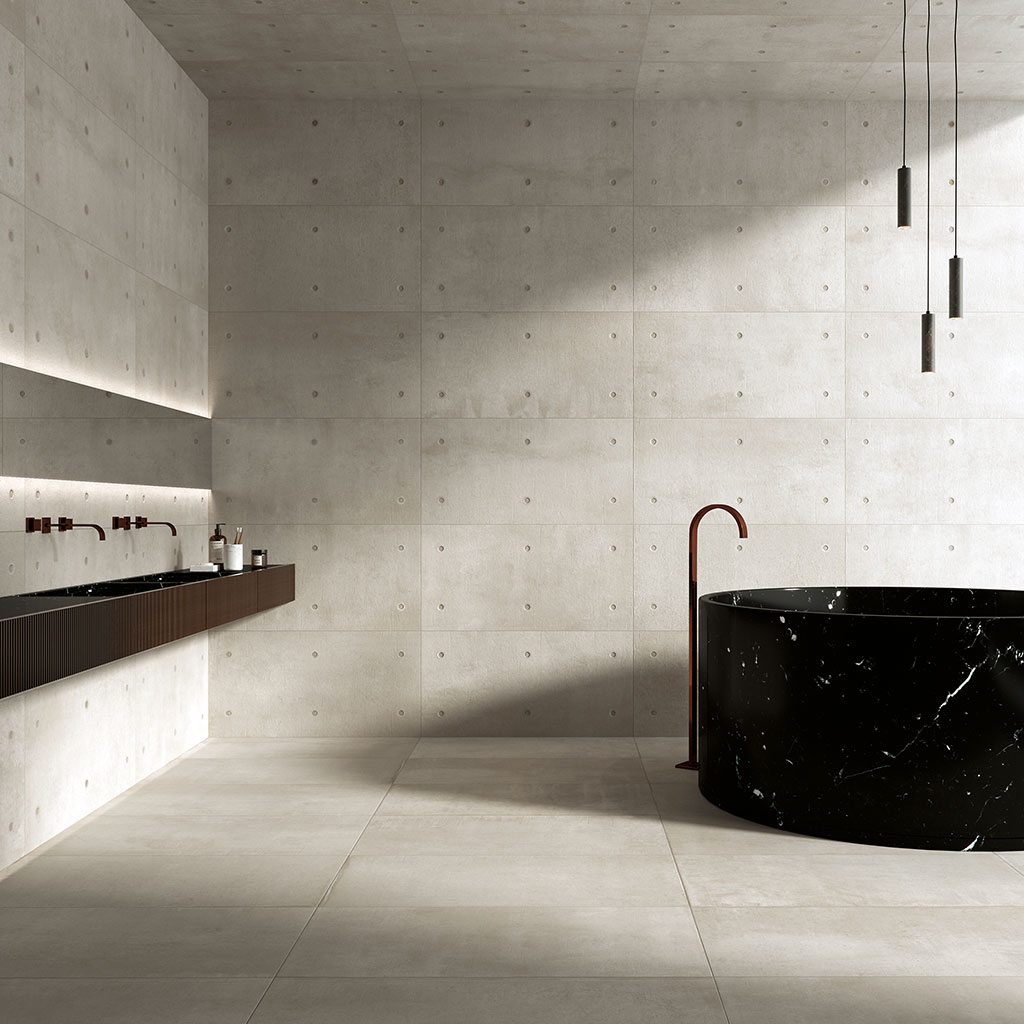
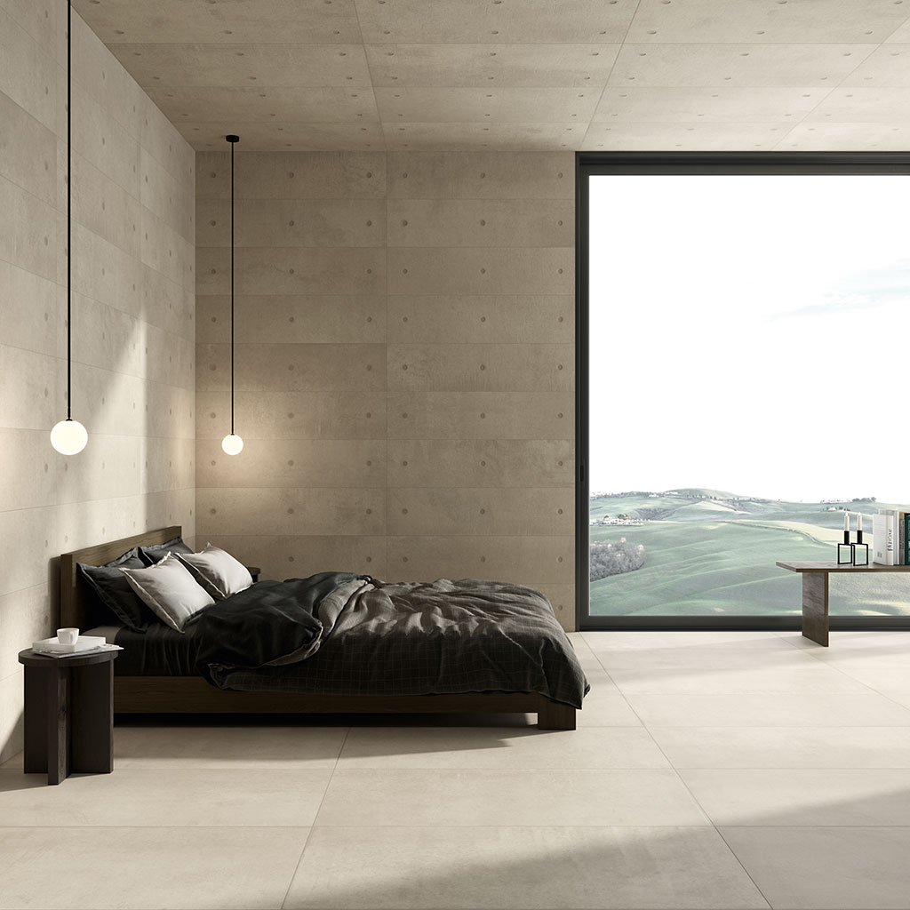
DOT by Andrea Maffei: a refined reinterpretation of concrete
Anyone who loves rationalism in architecture cannot fail to appreciate the DOT collection, Architect Andrea Maffei’s interpretation of concrete, the material that perhaps best defines modern architecture. “Reinforced concrete” has, in fact, radically transformed the way of constructing homes, and architects have been using it since the last century as a symbol of modernity and human progress.
DOT is the interpretation, using porcelain stoneware, of a particularly rich architectural concrete. The unique distinctive feature of this exposed concrete is precisely the DOT, that is, the point left by the matrix on the cement, creating a geometric pattern on the entire surface.
DOT makes a common material like concrete accessible to everyone; it’s rare, however, to find in standard buildings similar sophisticated architectural styles and features.
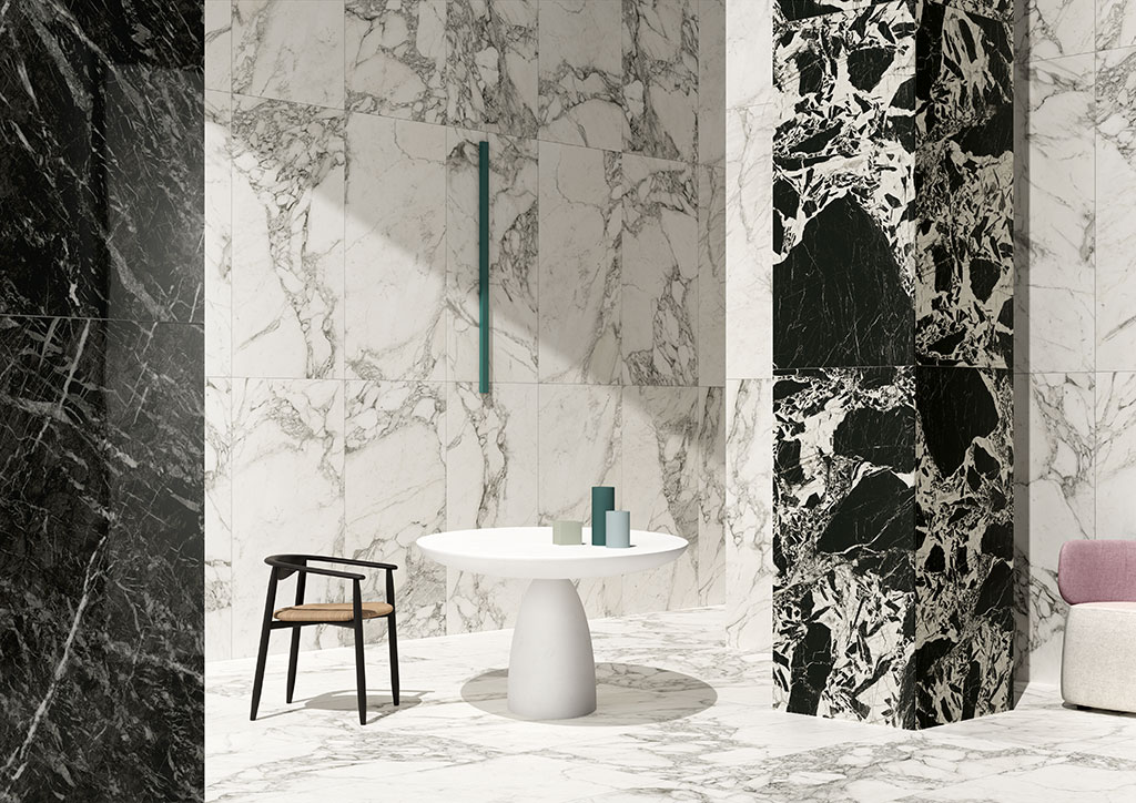
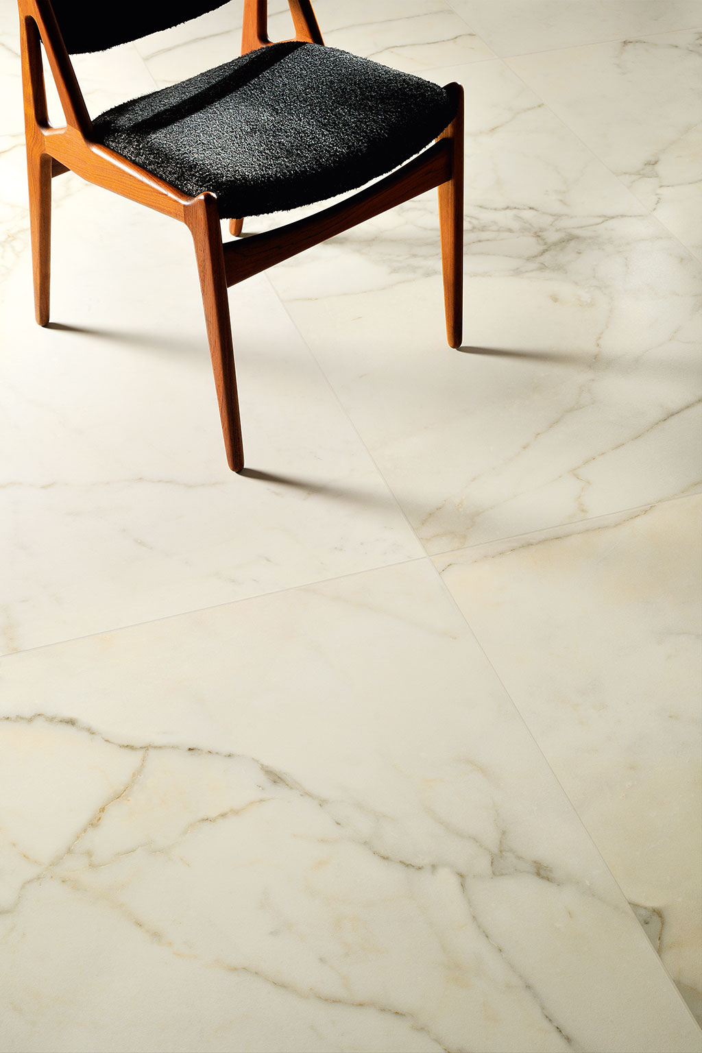
Prestige: a delicate balance between light and dark colours to celebrate the effect of the most precious marble.
Beautiful and refined taste: this is Prestige. A special collection that takes its inspiration from marble and its reflections, unique shades for environments with elegant and striking furnishings. The Prestige collection has been created to offer pairings of light and dark colours, both warm and cold. The coupled surfaces in the series create pleasant black and white contrasts, but can be used also singularly.
Suitable for floorings and wall-coverings in crossover environments in any style, highlighting the timeless magnificence of the finest marbles. Available in the large formats, Prestige also comes in smaller formats, 30×30, 15×30 and 15×15, and the collection is enriched with decorations with a graphic inlay on the 30×60 size.
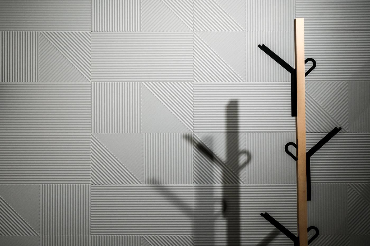
The fascination of Milanese design: this is Frammenta!
Milan has always been the capital of style and design. This is precisely the premise behind the Frammenta collection, which reinterprets an element and material typical of traditional Milanese architecture, Ceppo di Gré, the Italian rock from the place of the same name, Gré, whose name means, precisely, “rock with pebbles”. The collection has a marked irregularity of grains, or pebbles, with areas with mini stones and others with macro stones which makes it visually striking and the key feature of residential or commercial areas, both indoors and outdoors. Ceramica Fioranese interprets its main characteristic, offering a more structured ceramic version and the more common natural and polished finishes. Harmony and light are the main features of this collection which can be combined with inspiration and taste with the DOT collection.
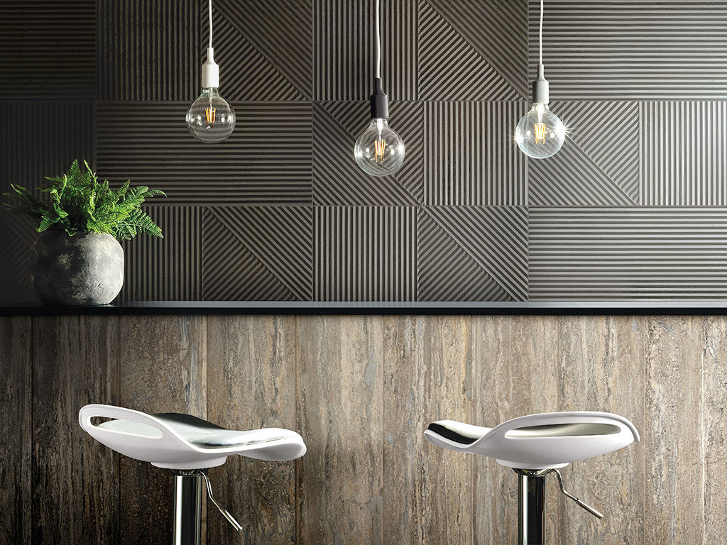
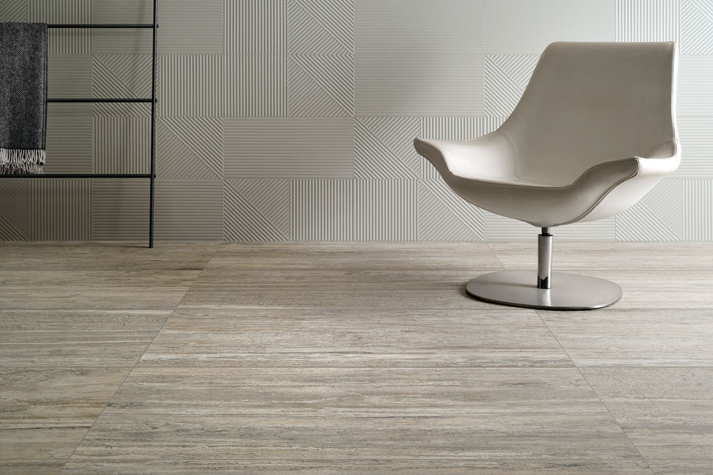
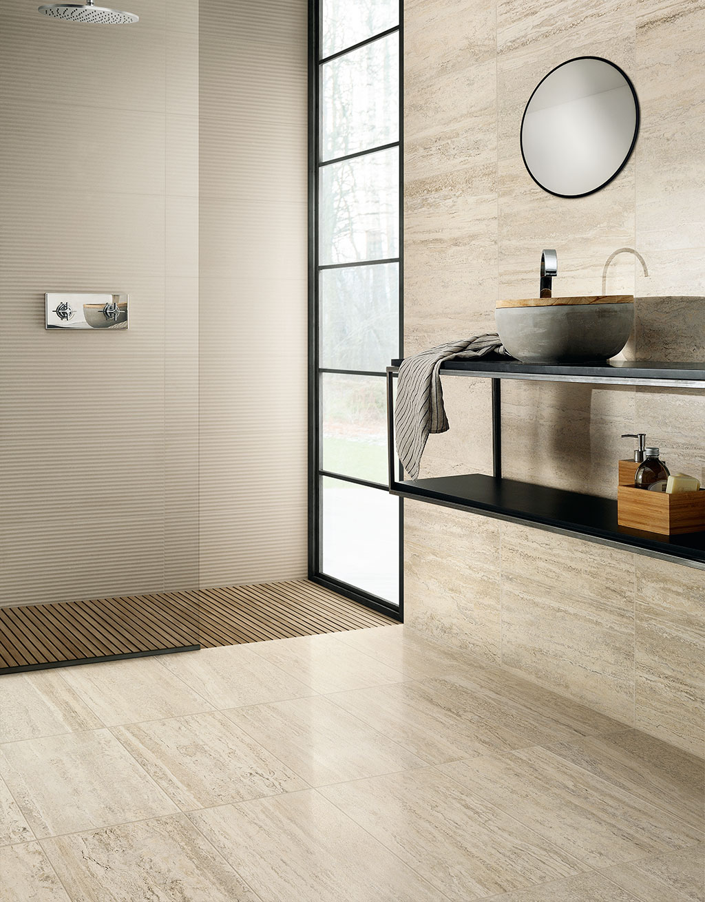
The elegance of Trastevere Vibrato as a tribute to the beauty of nature
Essential and modern elegance for bright and unique environments. Light and good taste for reinterpreting classical styles are the characteristic feature of this collection.
Trastevere Vibrato is the representation of an intimate link with nature, underlined by faithful digital reproduction: the research and care in reviving the beauty and elegance of a noble product such as travertine, generates a porcelain stoneware of exceptionally high technical and aesthetic quality. The graphic texture, characterized by homogeneous striped streaks transforms the surfaces into scenic designs, always different and potentially of great aesthetic impact, introducing into environments the atmosphere and beauty of the natural world. The colour ranges from ivory to mocha, via three intermediate tones. The jewel in the crown is the LUX finish available in the 60×120 format: a “full” polished finish that underlines the depth of the graphics and lends an extra touch of sophistication to the collection.
The Liquida collection illuminates the Show with colour
Davide Tonelli has been responsible for the amazing Liquida collection for Ceramica Fioranese. Shapes and patterns evoking designs from the 1950s are updated by great attention to colours which transform tradition into fashion. Liquida, the company’s new 20×20 cm project, is the beginning of a new ceramics adventure. Six pastel colours, the result of careful research into the new colour trends: ivory, dove grey, pink, sage, sugar-paper blue and cocoa, to create a truly eclectic porcelain stoneware, completed with eight patterns expressing different languages of contemporary design, able to dialogue with residential environments and otherwise. The surface takes inspiration from a contemporary natural lime with the classic movement characteristic of application by hand. Liquida offers the possibility of creating numerous installation combinations: thanks to the choice of different colours and patterns, it’s possible to create completely different settings with a single collection.
Liquida is also available in the 120×260 cm format, a decorative slab which is a reproduction in micro-texture of the eight designs offered in the small format of the collection. The slabs proposed can be easily combined with the 20×20 cm tiles but also “crossed-over” with other collections on the basis of styles and colourings.
PASSEPARTOUT: the innovation of full colour ceramic panels
The power of colour: this is the mood of the second project followed by Davide Tonelli for Fioranese which impressed and amazed us at Cersaie. The walls are full of single colours through the use of volumetric ceramic panels in porcelain stoneware. There are two forms available in a scale of soft pastel colours – to be used instead of neutral colours and white – in matt finish, evoking a timeless elegance and offering contemporary solutions and infinite combinations used alone or together with other collections.
SHARE THE ARTICLE ON YOUR SOCIAL MEDIA PROFILES:
