New light for our spaces
A special colour that speaks to the spirit
We are very excited and cannot wait to use the new colour Pantone has chosen for this year. As we know, 2023 was the year of Viva Magenta, an unconventional shade sitting between red and blue, balanced between warm and cool. This year, Pantone’s colour experts have proposed a more serene and calming colour. Described as “a velvety gentle peach whose all-embracing spirit enriches heart, mind and body.” Thus, Peach Fuzz, with the code 13-1023, has been named the 2024 Pantone Colour of the Year. We can already picture how we can use and combine this colour to make our public or private spaces really vibrant and captivating. This colour allows us to enhance the dimensions and organic flow of rooms. Let’s get to know Peach Fuzz better and unleash our imagination.
Let’s celebrate the world’s most “colourful” company!
Pantone has been choosing the Colour of the Year for many years now, advising companies in the furnishing and fashion industries and beyond on how to personalise accessories, clothing, furnishings… even the colour of cars! What are we talking about? The presentation of PANTONE 13-1023 Peach Fuzz marks the 25th anniversary of the Pantone Colour of the Year programme, which was first launched by the Pantone Colour Institute in 1999. The programme has now become a global event, serving as a benchmark for identifying trends of the year. Visit www.pantone.com to learn about Pantone’s history and discover many interesting facts.
New year, new Pantone
Let’s hear directly from the experts who chose this new colour and understand the inspiration and significance it holds. The Pantone Color Institute, the world authority on colour, explained their choice of the colour of the year with these words: “Our need for nurturing, empathy and compassion grows even stronger as does our imaginings of a more peaceful future.” This is why a subtle and luminous peach colour was chosen “that captures our desire to nurture ourselves and others. It’s a velvety gentle peach whose all-embracing spirit enriches heart, mind and body.” Leatrice Eiseman, Executive Director of the Pantone Color Institute, adds, “In seeking a hue that echoes our innate yearning for closeness and connection, we chose a radiant colour with warmth and modern elegance. A shade that resonates with compassion, offers a tactile embrace, and effortlessly bridges the youthful with the timeless.” We already love it!!
Introducing Peach Fuzz!
Subtly sensual, the heartfelt shade of 13-1023 Peach Fuzz brings a feeling of kindness and tenderness and conveys a message of caring and sharing, community and collaboration. Pantone also provides suggestions on how to use the new colour in various areas such as “fashion, graphic design, multimedia design and more – visit their website for plenty of ideas. 13-1023 Peach Fuzz inspires belonging, recalibration and an opportunity for nurturing, conjuring up an air of calm, providing us with a space to thrive and flourish. Drawing comfort from 13-1023 Peach Fuzz, we can find peace from within, impacting our wellbeing. It awakens our senses with the comforting presence of tactility and enveloping warmth.
Coordinating the colours
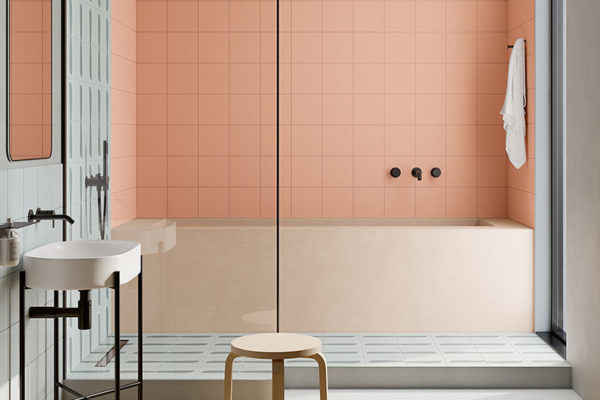
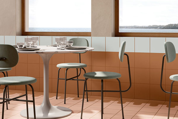
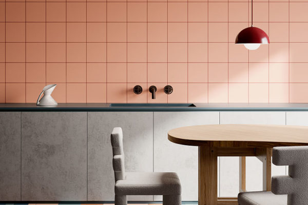
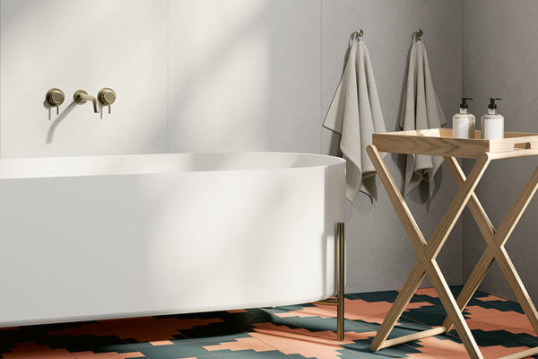
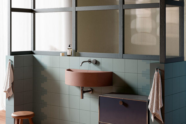
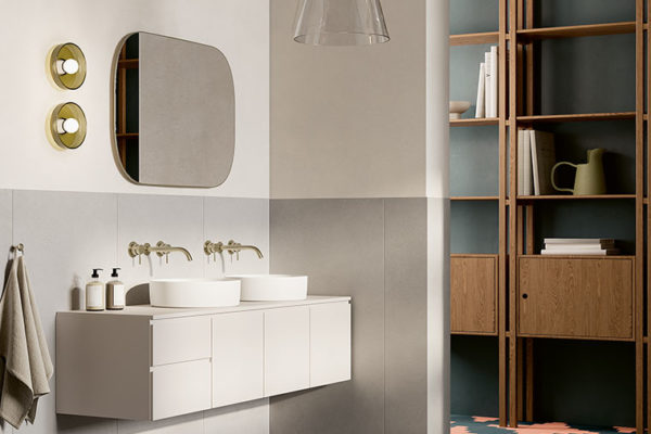
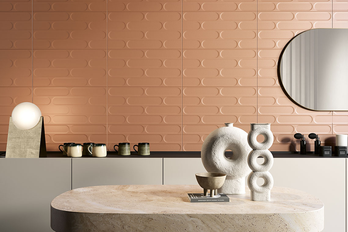
Colour experts regard these shades as a new group of neutrals, a trend that companies have been predicting since the pandemic. Peach Fuzz is ideal as a floor and wall finish, especially in bathrooms, where it’s also noted to be “very flattering for all skin tones!” Unsure how to coordinate Peach Fuzz with the rest of your home? Don’t worry – there’s a wide range of possibilities. If you prefer lighter tones, colours like white, ivory, cream, beige, taupe, and soft shades of grey work wonderfully. If you want to be a little more daring, opt for buttery yellows, bright oranges and even blues. However, Peach Fuzz truly shines when paired with other warm pastel shades such as sky blue, wisteria, candy pink and light olive green.
Bright and cosy rooms
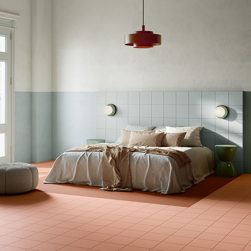
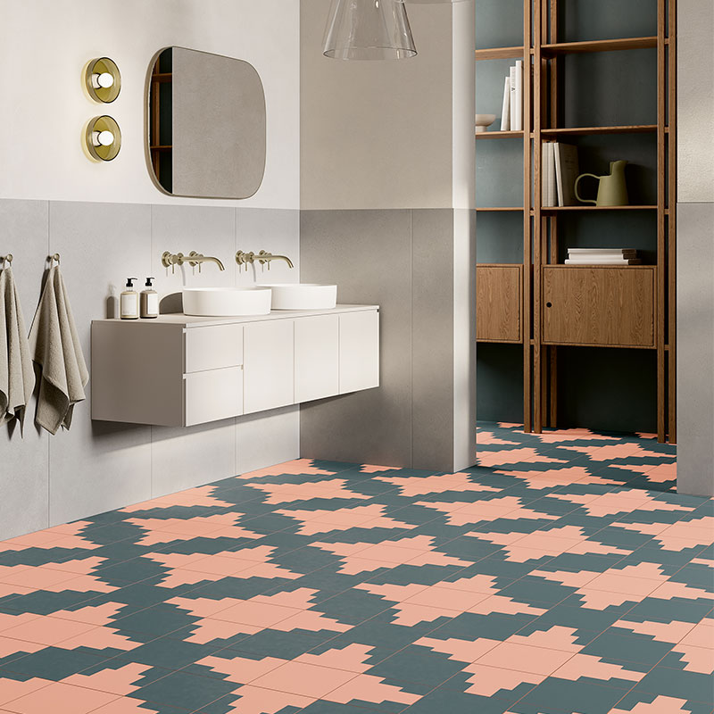
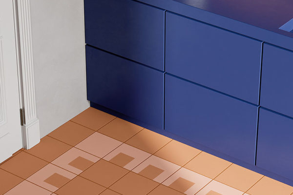
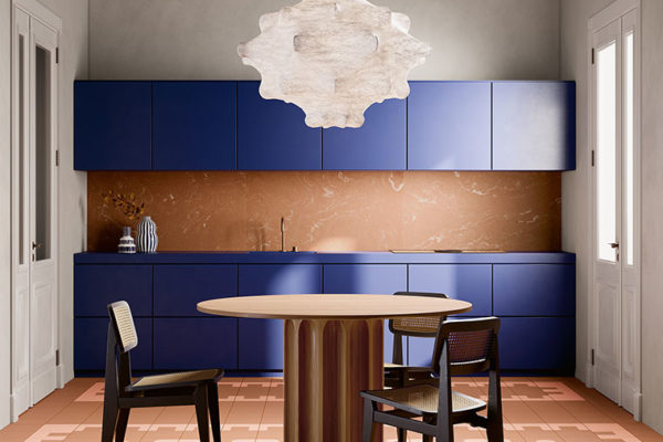
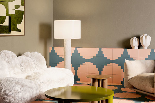
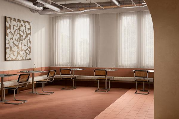
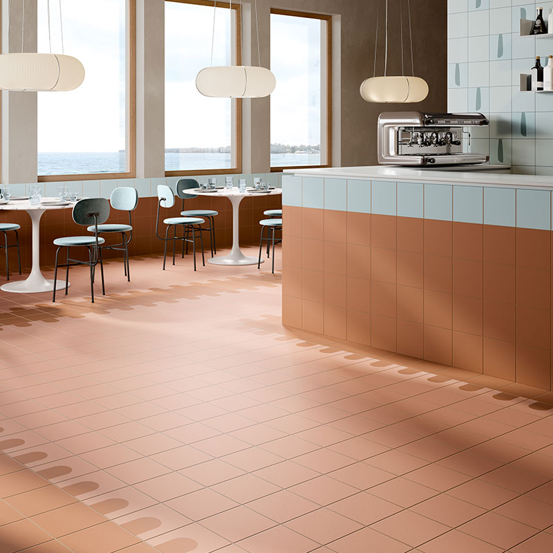
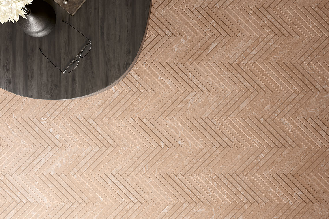
Fioranese has already recognised the potential of this colour and offers several collections that beautifully interpret this new trend. Among these collections are numerous options featuring pastel shades that perfectly match the colour of the year, along with other nuances that can be easily coordinated to it, making rooms brighter and warmer and adding a touch of elegance and airiness to every corner of the home. One standout collection is the ‘Italian Landscape’ porcelain stoneware collection, which was born from the collaboration between Fioranese and the 23Bassi architecture firm. The collection was inspired by a deep love for Italy and its abundant treasures, a land that provides fresh ideas and encourages one to look at things from a different perspective. The project is centred around three iconic Italian cities – Florence, L’Aquila, and Siena – representing what Italian art means to the rest of the world.
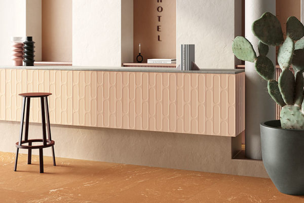
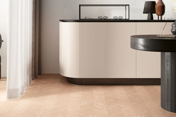
Offering a variety of stunning pastel shades in unique formats, the Italian Landscape collection provides ample opportunities for various graphic combinations. This collection is the perfect way to enhance and coordinate your interiors with the new colour of the year. On the other hand, the ‘I Variegati’ collection, particularly the powder variation, will give Peach Fuzz a contemporary elegance, drawing from its innovative take on traditional terracotta. This collection blends the material-like appeal and history of variegated terracotta – representing Italian excellence – with modern industrial techniques. The result is a brand-new product that combines the beauty of tradition with the outstanding performance of industrial technology. Geometric and decorative streaks create a highly textured marble effect. Alternatively, you can opt for the ‘Fio.Biscuit’ collection to incorporate Peach Fuzz into your spaces. This collection beautifully reinterprets traditional delicate tones to give spaces character while making them extremely modern. An effect resulting from careful research into forms and colours that bridges tradition with contemporary trends. Discover all the soft-touch matt colours of ‘Fio.Biscuit’ to create truly unique rooms and stay on-trend with the Pantone colour of the year.
SHARE THE ARTICLE ON YOUR SOCIAL MEDIA PROFILES:
