The colours of the soul
Numerous nuances for the spaces we love best
As many of you will already know, colours have an enormous influence on our mood, and every one provokes a certain reaction in each of us. It’s a subjective sensation, a stimulus that is perceived by our brain, and when decorating and furnishing our own home it’s clear how complicated can be the choice of colours that will then influence our moods every day. The choice of colours is always an aspect to think about carefully, especially if the aim is to engender harmony and balance in environments without making them pompous, cloying or anonymous. Today we will discover something new about colours in order to be able to choose the finishes that we like best for our living and commercial spaces. We begin by saying that the colour chosen by the Pantone institute as the symbol of 2022 is called “Very Peri”: “A dynamic periwinkle blue hue with an enlivening purplish red undertone combines the fidelity and consistency of blue with the energy and excitement of red”, according to Laurie Pressman, Vice President of Pantone Color Institute, explaining the choice: “We can reflect the innovation and global transformation under way thanks to a new colour. Society is continuing to recognise colour as a fundamental form of communication and expression and the complexity of this new blue hue highlights the possibilities that are opening up before us”.

To each their colour
But do you really know the colours? Let’s begin by saying that there are primary, secondary and tertiary colours: the primary colours are yellow, blue and red. By mixing the primary colours in equal parts we obtain the secondary colours: orange, green and purple. Finally, the tertiary colours are obtained by mixing the primary colours in different quantities to produce different hues of the secondary colours. Opposite colours in the wheel of colours are complementary and create a sharp contrast that enhances the respective brightness.
Do you know chromotherapy?
Almost a veritable science, chromotherapy studies the influence of colours on us; according to this theory, each colour has its own meaning and transmits certain emotions, influencing our mood. It’s clear that each colour communicates a different sensation, which should make us reflect when choosing the shades of our rooms and the relative furnishings. Red, for example, is the colour of energy and is associated with strength and vitality. Green is a harmonious and relaxing colour, calming and a symbol of equilibrium, while blue is the calming and refreshing colour par excellence: it soothes the mind and reduces agitation. There are thousands of colours and thousands of nuances…what colour do you like best?
What’s the right finish for brightening an environment?
As we have seen, colour is fundamental for giving character and balance to the spaces in which we live every day. The finishings and nuances that are chosen for walls and floors are of enormous help in brightening up a space with little light and are also a fundamental tool for visually enlarging a small space or making a very large room more intimate. A space can, in fact, appear large to the eyes when the finishes are particularly light and with warm nuances: it’s possible, on the other hand, to use more particular colours, also very strong, to give more character to walls and floors, creating the right background for our furnishings. In general, it’s essential to also consider how a colour changes under natural and artificial light before choosing it for a room. Fluorescent lights, for example, are better in a warm shade to be re-equilibrated, while incandescent lights are perfect with cold shades and halogen lights perfectly match all colours.

Falling in love with colour
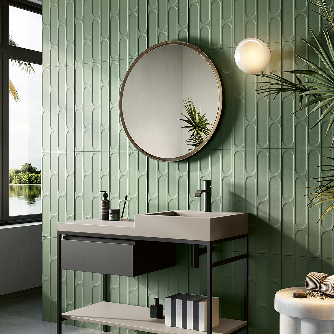
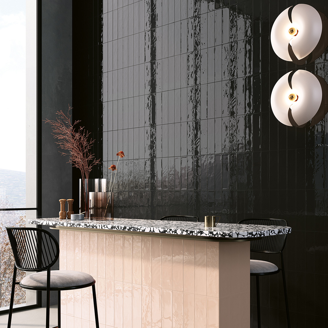
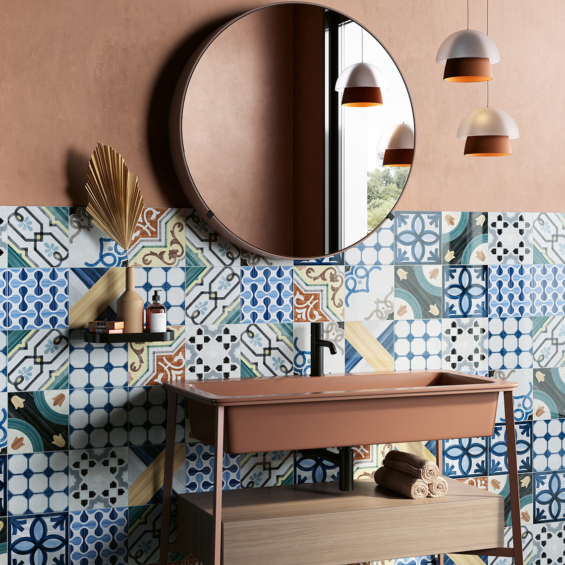
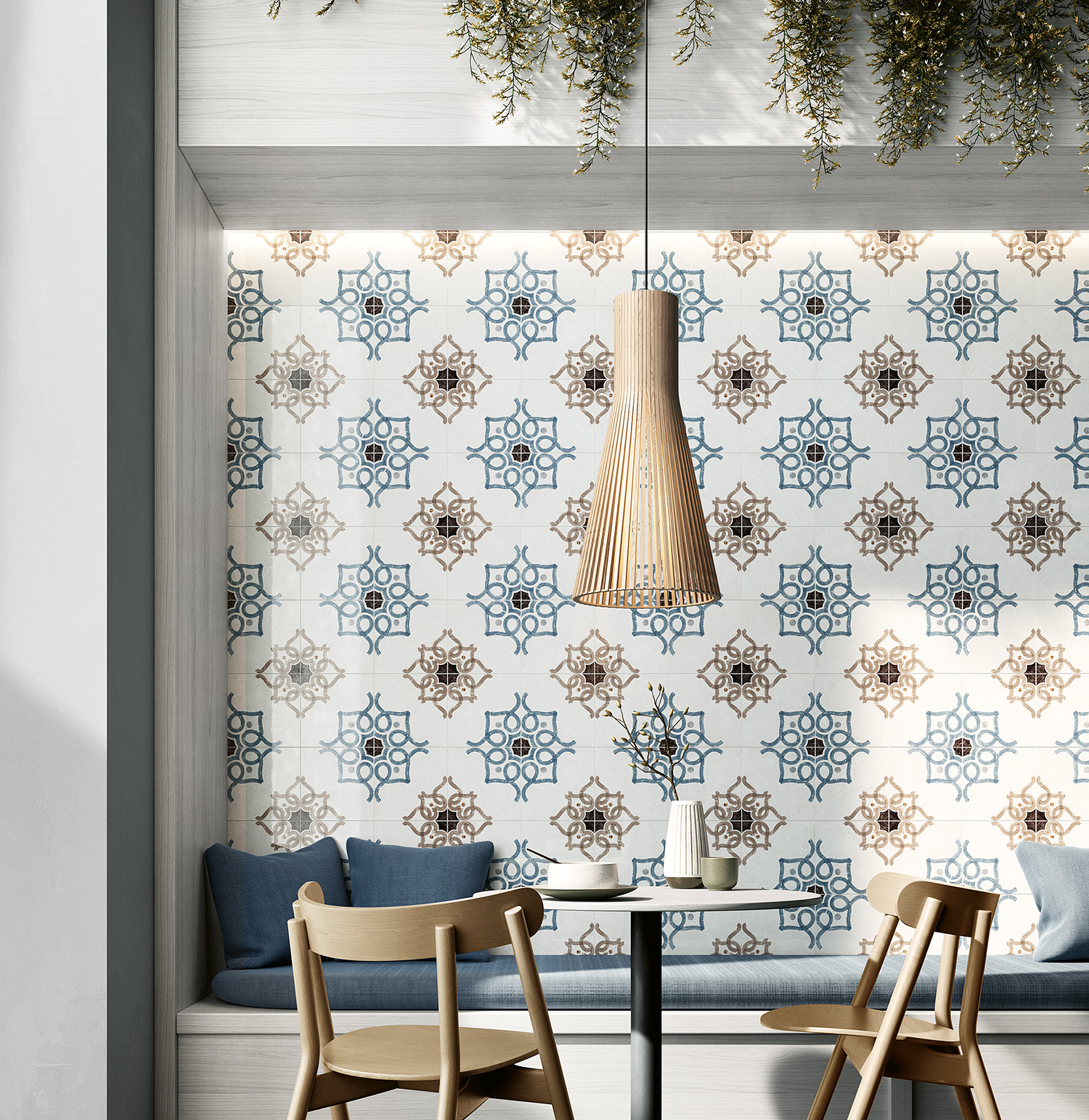
Ceramica Fioranese loves developing collections that interact with very particular textures and colours in a perfect balance. Some follow current trends belonging to the world of fashion and design. The surprising Fio.Glossy Brick, for example, is an evocative collection of magic atmospheres with extremely captivating shiny and irregular surfaces, offered in the characteristic “brick” format. Black, grey, beige, pink, green, white… the important thing is that it’s glossy! This collection is perfect for all environments of the home: a palette of colours and a surface that evokes the aesthetic prestige of ceramic tradition and lends environments a luminous vitality. Always on the search for colour but with a particularly modern allure? Why not opt, then, for a contemporary and sophisticated mood thanks to the Fio.Biscuit collection, created by Davide Tonelli. The attention to forms and colours, in this case, allows tradition to become trendy; the collection has an extraordinary palette, with opaque nuances, which create elegant graphics for special and welcoming atmospheres. If, instead you want to make a must of decoration, the colourful and iconic designs of Cementine Shiny are truly perfect, designed by Silvia Stanzani. Thanks to this collection, it’s possible to create authentic decorations both on floors and walls, and even on furnishings such as counters, using really the most brilliant colours: it’s well known that you can never have too much colour and joy!
Are you ready to enter into the world of Fioranese colours?
SHARE THE ARTICLE ON YOUR SOCIAL MEDIA PROFILES:
