Environments are coloured again
Many shades to choose from and an innovative Pantone colour for 2023
When designing a room, colour plays a fundamental role. The perception of colours in interior design has been examined by numerous studies related to psychology and how it affects emotions. As a universal language, colour is a powerful communication tool that conveys meanings and moods in an immediate way. Every space can be embellished and made unique through the skilful use of colour. Today we will discover the meaning of this year’s Supreme nuance, which was chosen by Pantone and which will undoubtedly influence all areas, from creativity to fashion, from furniture to interior design. Let’s see how to best use it and the numerous possibilities it offers.
What is the Pantone Colour of the Year?
The Pantone Institute is a US Graphic Design company that has catalogued practically all existing colours using unique codes so that they can always be identified and reproduced in the same way. For more than 20 years, the company has been electing ‘The Colour of the Year’; the colour that will set the trends for 2023 will be ‘Viva Magenta’, PANTONE 18-1750. After Very Peri in 2022, a symbol of courage, renewal, personal inventiveness and creativity, Pantone has now chosen a colour that serves as an invitation to explore new possibilities with a clear connection to the digital world.
Viva Magenta!
It’s a colour with crimson red tones that expresses vim and vigour. Viva Magenta is expressive, full of wit and inclusive for all and offers a new power in any context. “In this age of technology, we look to draw inspiration from nature and what is real,” states Leatrice Eiseman, Executive Director of the Pantone Colour Institute. “PANTONE 18-1750 Viva Magenta descends from the red family and is inspired by the red of cochineal, one of the most precious dyes belonging to the natural dye family as well as one of the strongest and brightest the world has known.”
Knowing how to choose the right colour for every room
There are many aspects to be considered in order to use colour wisely to define our spaces. For example, if we choose dark, warm colours for floor and wall finishes, a bit like Viva Magenta, the room will give the impression of being cosier and more intimate. Instead, if we opt for finishes in more subdued colours, such as light pastel shades, this will give the effect of a more spacious and larger room. It’s important to be aware of these “optical effects” to avoid making serious mistakes that could lead to not making the most of the room you are designing.
How to match colours correctly
Matching colours in an optimal manner, within a space, should never be taken for granted, but even in this case, it’s important to start with the basics. For example, it’s always a good idea to choose tone-on-tone colours. Without risking much, tone-on-tone allows us to play with various shades to create a more vibrant interior while keeping the colour choice consistent. We can also opt for complimentary colours that allow us to create an eye-catching effect with tons of personality. In fact, this solution is ideal for giving rooms a playful and lively appearance. The tip is to remain within a triad of colours, and to use their nuances, so as not to risk a chaotic and disorderly effect. This is also good advice for making the best use of the 2023 Pantone colour.
Precious nature of Crimson
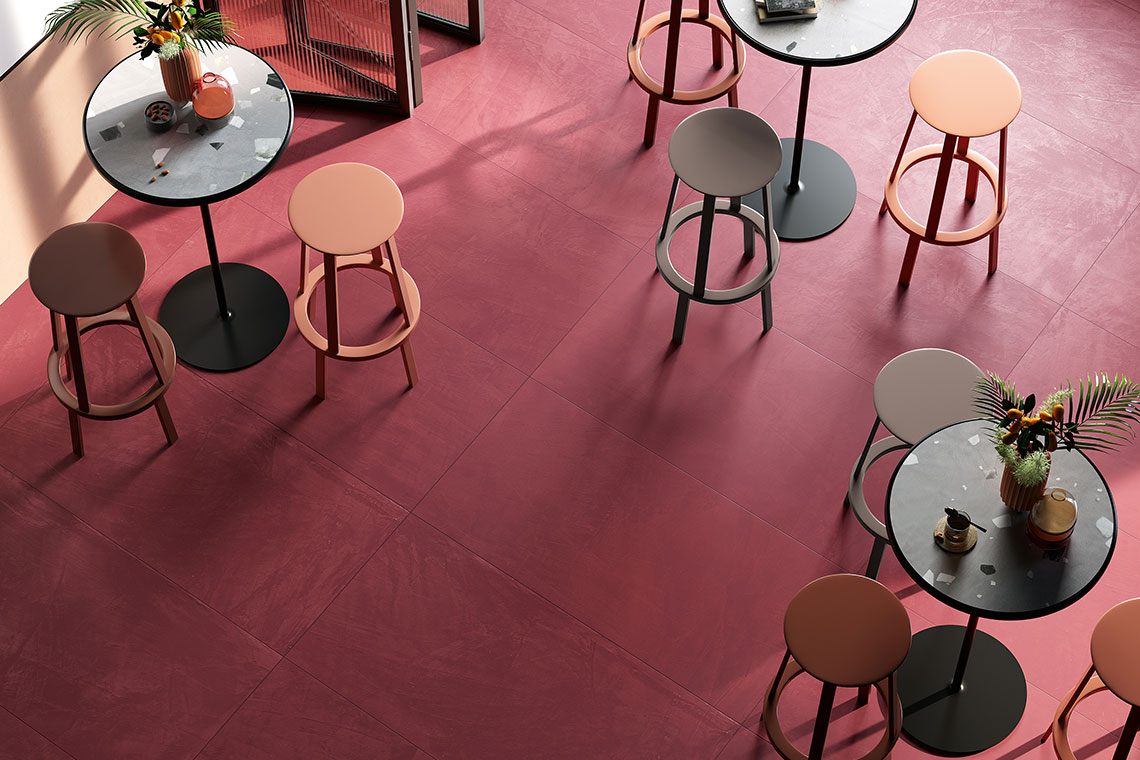
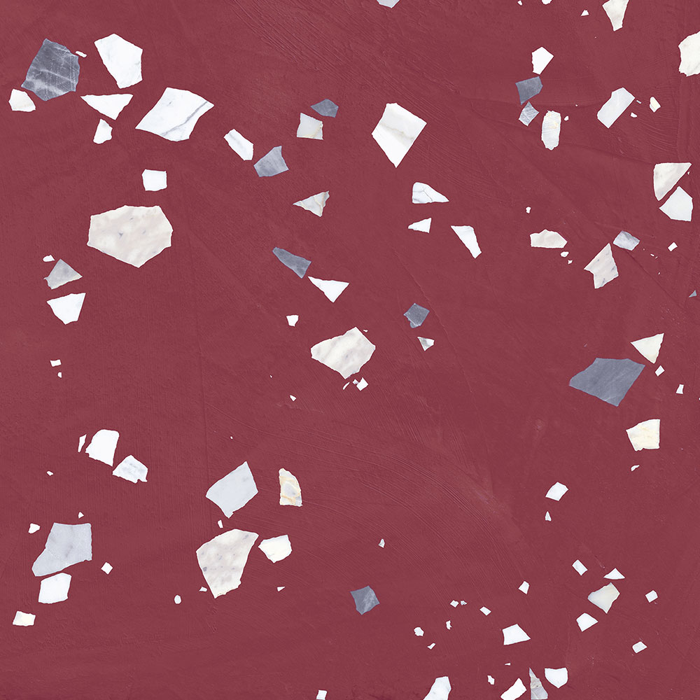
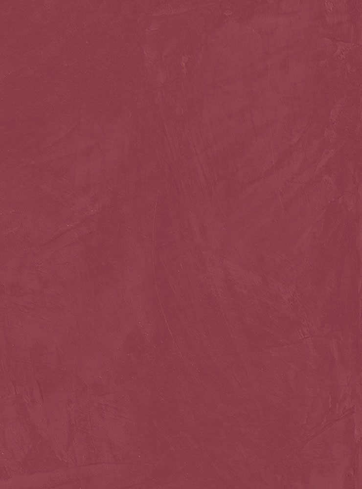
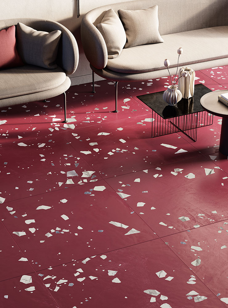
When we consider the 2023 Pantone colour, we cannot help but think of Fioranese’s ‘Schegge’ collection in the shades of Porpora (Crimson) and Porpora Deco, which interprets this colour in a unique way, enabling a special dialogue between matter and space. In general, ‘Schegge’ means that when everything seems to be flowing normally, something can distract us from the ordinary, and we discover that a creative movement can give life to something new. Thus, marble is fragmented into irregular splinters of different thicknesses and expands on resin-effect porcelain stoneware in warm tones, creating irregular and dynamic patterns. The Porpora and Porpora Deco variants are the perfect solution for introducing Viva Magenta into our environments. ‘Schegge’ is a collection intended for those who want to create original environments enriched by unexpected decorative effects: this is thanks to the inclusion of marble-effect fragments scattered randomly on the surface. Highly effective material-like effects emerge from the surfaces also thanks to the innovative ‘Matter on Top’ technology, which allows new boundaries to be reached in the definition, texture, colour and structure, surpassing previous ones and renewing the aesthetic value inherited from the ceramic tradition, while maintaining the same indestructible strength of stoneware.
SHARE THE ARTICLE ON YOUR SOCIAL MEDIA PROFILES:
