Land of Italy and FIO.Block: two new collections born from the cooperation with Davide Tonelli
Fioranese presents two new collections with great appeal
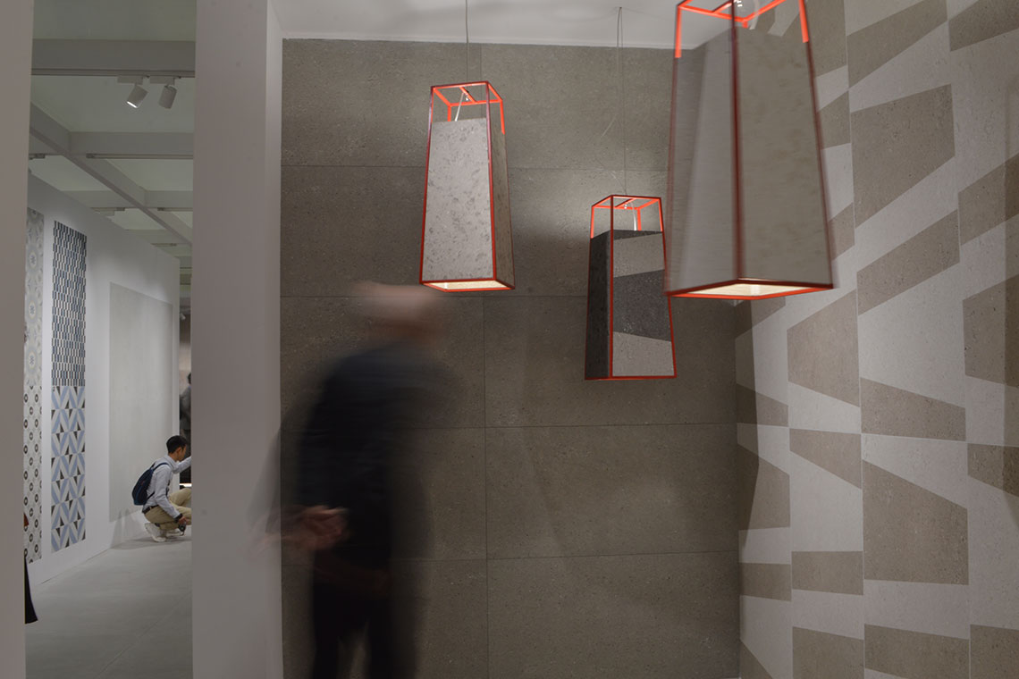
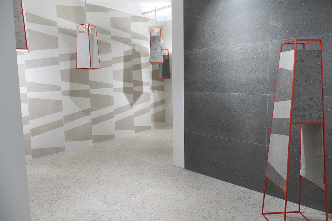
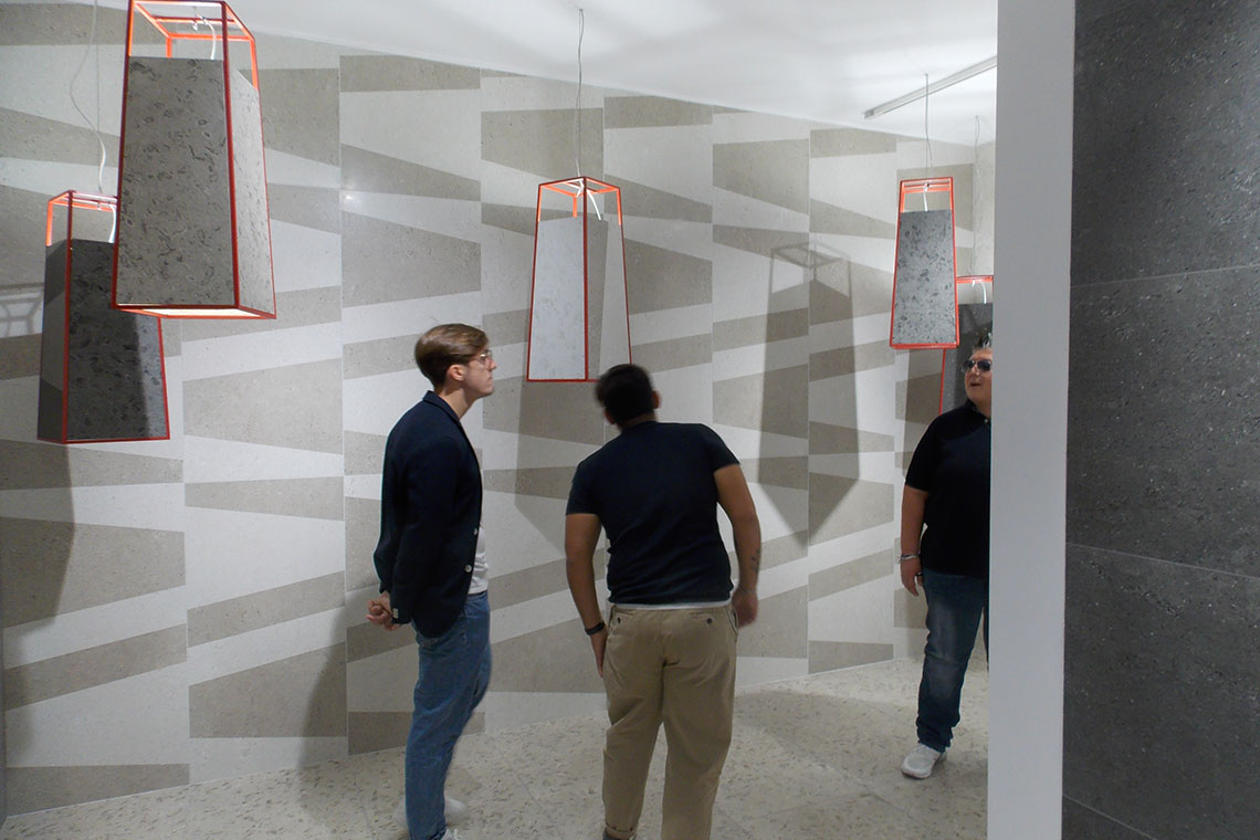
The Made in Italy cooperation between Davide Tonelli and Ceramica Fioranese continues. The two collections presented at this edition of Cersaie stood out for the level of research and redesign of some historical elements which brought life to contemporary products with unusual effects. The new Block represents the natural continuation of the FIO. project, born in 2018 from the cooperation with Davide Tonelli; a product line blending design, history and craftsmanship. This project led to the first collections, Liquida and Passepartout; Block is the new collection which will amaze you with its contrasts and innovations, bringing life to truly creative coverings. The Land of Italy collection, on the other hand, explores Italian history, revisiting iconic stone which is both ancient and contemporary, ideal for enhancing settings with different styles and atmospheres. We met Davide Tonelli and talked about these two new collections.
1.Your lucky partnership with Fioranese continues with Land of Italy and Block, what advantages did you have working with them?
The first thing that comes to mind is harmony. Although it wasn’t the first time we worked together, even as an outsider, the Fioranese group has always made me feel like part of the “team”, our affinities in terms of ideas and approach have now found a practical harmony, also in the day-to-day working methods which we improve project after project. I think that empathy and sharing ideas are the foundations for the success of any project, and in this sense the spirit I have always found in the company since we began working together has never changed, or better, it has opened and expanded.
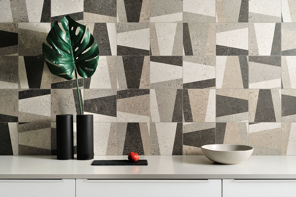
2.Why did you choose the “Aurisina Lumachella” stone for the Land of Italy collection?
I wanted to relive that generous and rich world of iconic Italian stone, investigating the relationship between history, contemporary design and the great cultural heritage of our landscape. Now the aim is to capture the beauty of stone, underlining the role ceramics could play on a different level, without wanting to replace that of natural stone but rather entering into a profitable dialogue aiming to interpret people’s new needs and turning them into quality projects. Aurisina Lumachella is one of the ornamental stones that represent a specific cultural heritage, which stands Italy aside from other European countries. The diversified cultural wealth of our lands is reflected in the diversification of the landscape from North to South. The “rebirth of Italian icons”, characterising the urban and extra-urban landscape of different eras, as a strategic issue, has encouraged us to reproduce this stone and offer it a new life today.
3.Which colour shades can inspire us to customise our own living spaces today?
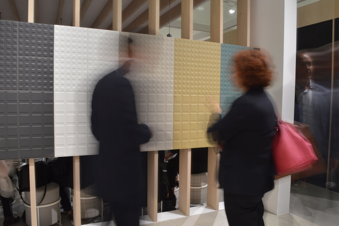
A renewed understanding of colour and a need to impress our own increasingly eclectic personality on spaces: I think this is the creative driver that must inspire us when choosing colour. No longer only neutral colours. Not only black and white, but blends of brighter colours bring life to unusual yet well-placed surfaces, with no compromise. Among the colours we will being seeing more of in 2020 I would mention mustard yellow with 1970s combinations, forest green to match with brown or dark red leaning to copper, blue, the colour of elegance, and more generally “pastel colours” used almost to replace neutral shades or combined with them, like beige that has taken the place of pure white..
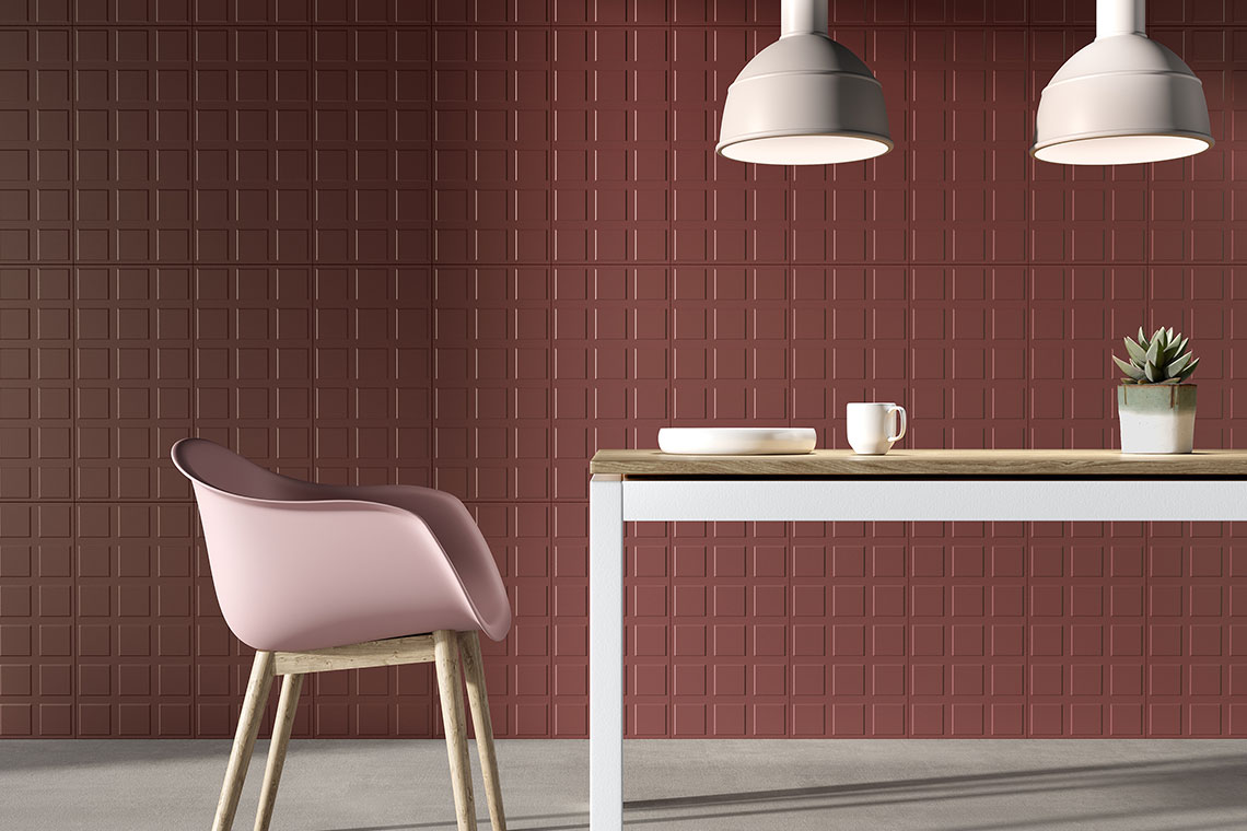
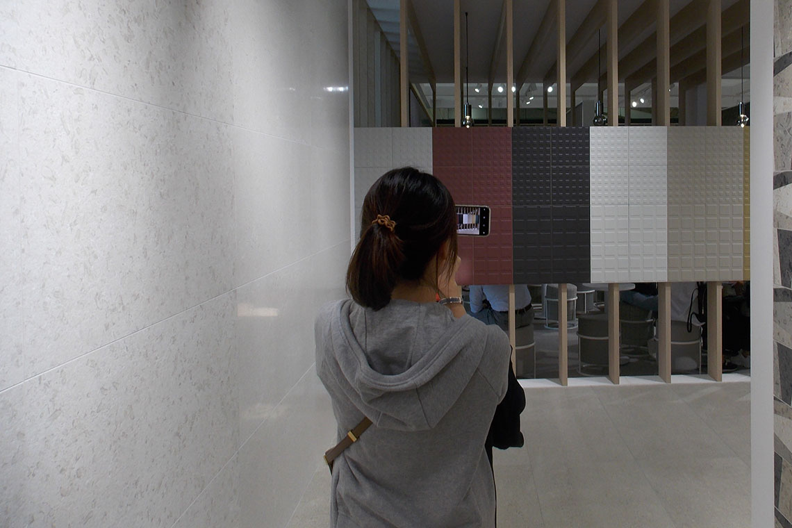
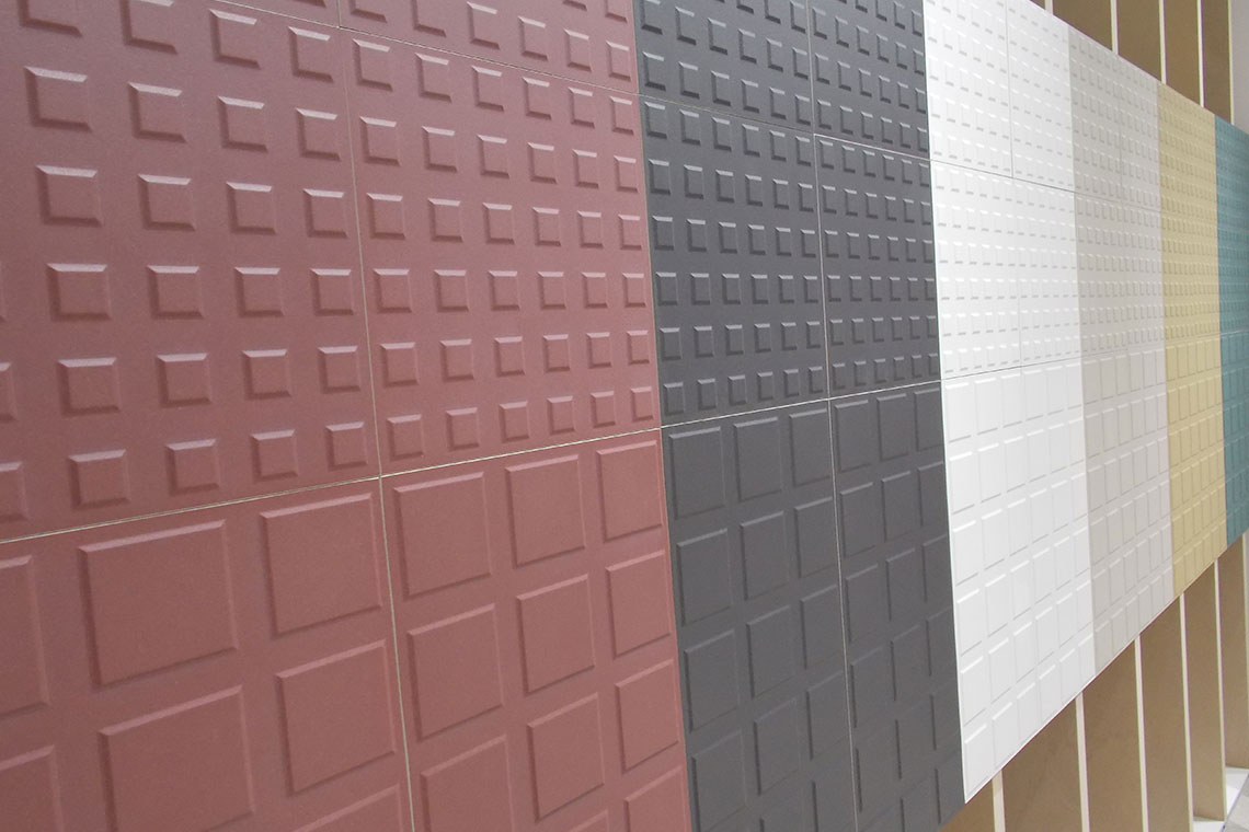
4.The FIO. project, that emblem of Made in Italy, is enhanced with the Block collection: how did
this project develop?
Block tackles the issue of colour within a “clean geometry” proposed in sizes 30.2×30.2 and 30.2×60.4 cm. Neutral colours blend with deep red with a strong character, forest green plays with tradition while honey, a shade of soft yellow, adds a nostalgic atmosphere to decorations, furnishings and surfaces. This is the natural continuation of the work which began in 2018 with Passepartout: the idea is to create material crossovers between collections, allowing those who work with FIO. to create spaces in which bold colour choice and the wish to dare are the central focus of the project.
5.What is the relationship between material, ceramics and geometry?
Materials + ceramics + geometry = the trait d’union is knowing how to dose them correctly, just like a recipe in the kitchen, in which the ingredients must be well balanced to create a great dish. The aim is customisation, or rather, offering unique solutions allowing designers to actively interact with the product, so that the product can become its own design tool, the means for expressing and communicating new languages.
SHARE THE ARTICLE ON YOUR SOCIAL MEDIA PROFILES: