The colour palette for 2022
Interior design, the colours that help to overcome stress
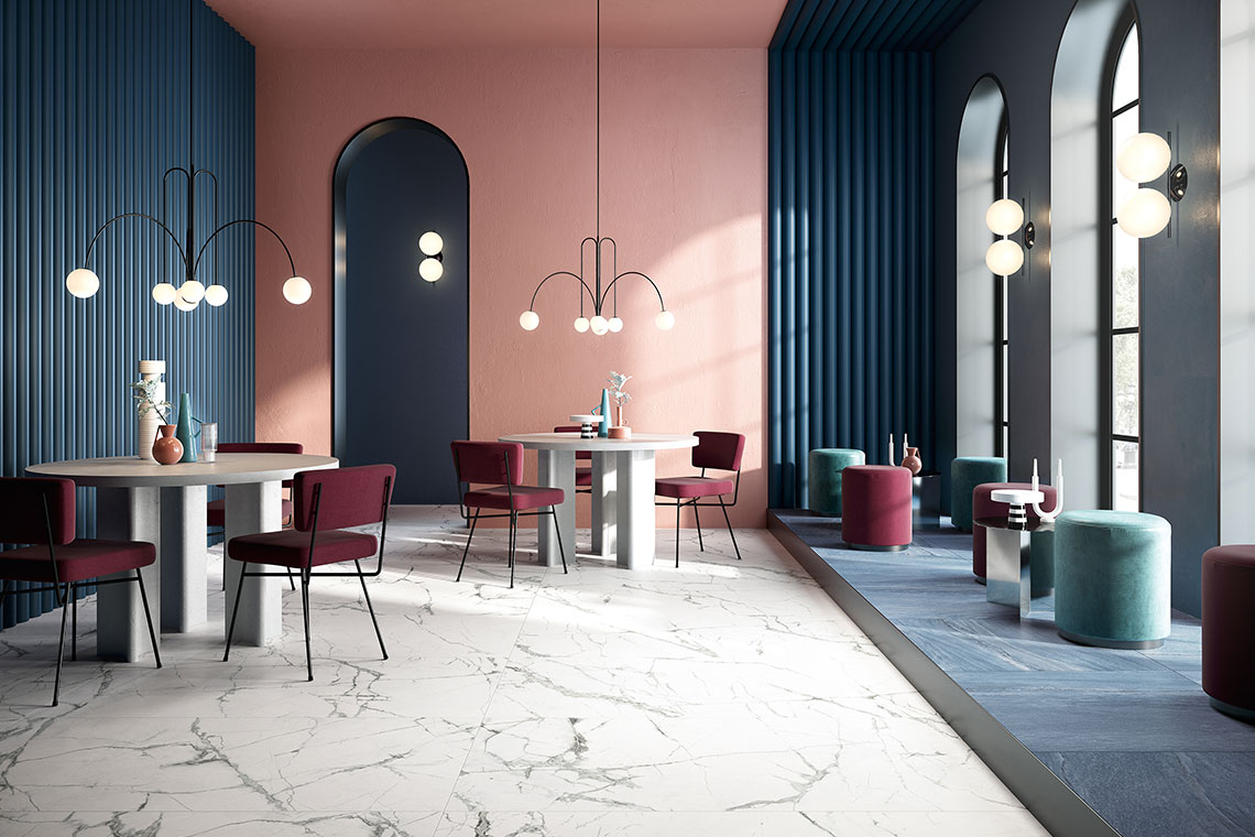
Aegean blue, green, yellow, beige, sage green and navy blue, but also softer shades such as powder pink. These are the main colours characterising 2022 interiors. According to Interior Design at University of Arts, London, there will be a tendency to use “botanical” decorations that make reference to vegetation and water. For Architectural Digest, instead, soft/nude colours, able to create a sense of calm after the difficult recent times we’ve been through, will be the big trend. In the colour palette for 2022 furnishing, we find lots of shades that evoke positivity and strength of character, revealing something new about the relationship between space and the use of colour.
Transforming spaces with colour
We’ve referred on a number of occasions to the importance of colour and its ability to significantly transform environments. It’s essential, therefore, to focus carefully on the correct choice of colours to use in different spaces. Besides personal taste, the context and the furnishing, there’s also the aspect of the psychology of colours! It has been demonstrated that colours are able, in fact, to influence moods and behaviour in different ways, and this field of study is able to suggest to us in which rooms it’s best to use certain colours rather than others, so as to exploit their positive effects. It’s obviously fundamental to choose a design approach to follow, in order to avoid turning every room into a world of its own, and the home into a disconnected collection of spaces. Let’s see some particular colours for 2022.
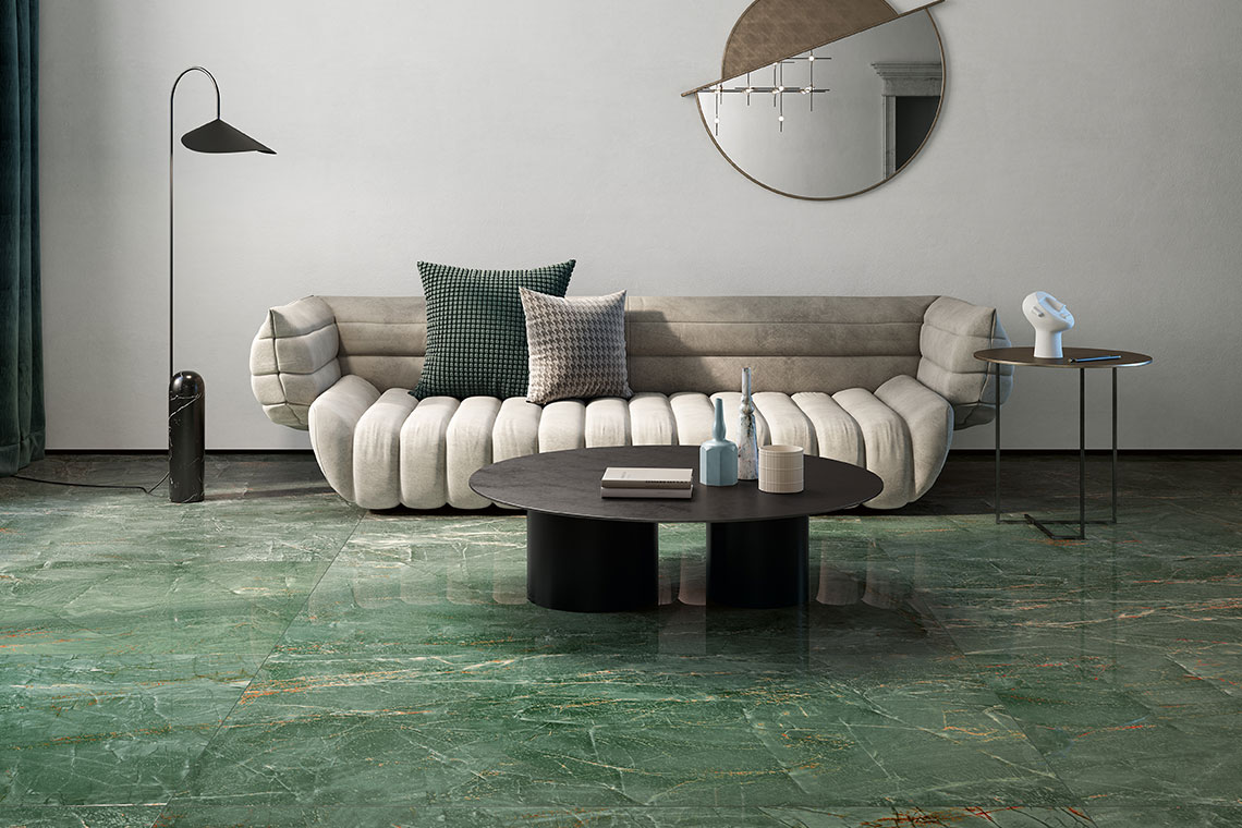
Honour to nature: green!
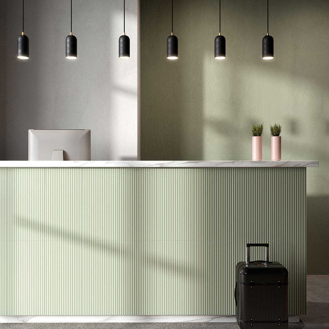
Green is an excellent way of personalising the finishes of a home. This colour makes it possible to create balance, peace and relaxation, refreshing environments just as plants are able to do! This characteristic makes green suitable for any space, from the day area to the night area, as well as the bathroom. The combinations to use depend on the shades chosen: with softer ones, it’s possible to venture some “colourful” combinations while, if more decisive shades are chosen, it’s better to opt for neutral colours.
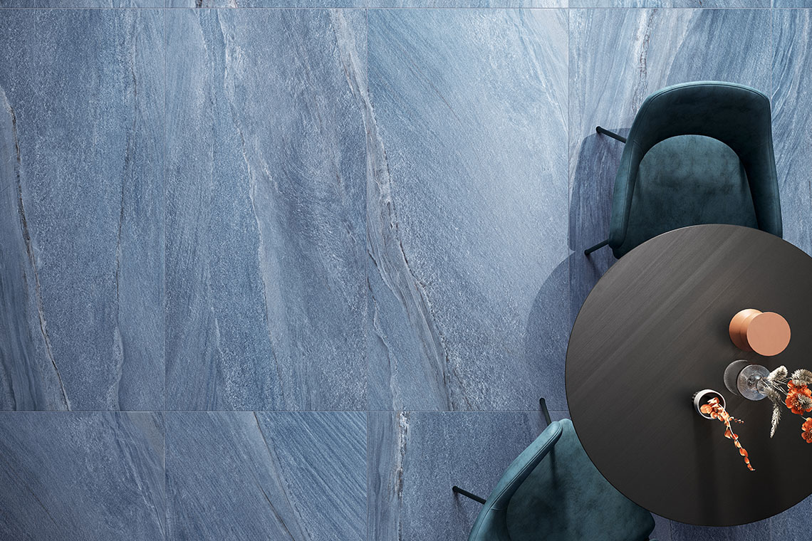
Blue and its nuances
If you want your interior spaces, on the other hand, to recall the blue sky of a hot summer’s day, or the waves of the sea on a day of relaxation, then blue is the perfect colour for your internal environments. Perfect for accessories or furniture, but also for decorating walls, or for coverings or furnishing accessories, blue in all its nuances easily combines with other colours. Blue is perfect for the bathroom, but also in the kitchen and in the living area. Blue is also perfect for brightening up the environment in the choice of furnishing accessories, from fabrics to pictures, to the carpet. Finally, it also goes well with the beauty of natural wood and the shininess of metal.
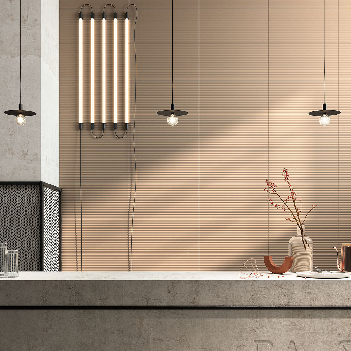
Warm like the sun
Equally warm and captivating, yellow is also a big feature of 2022, especially for walls. And if the question is how to match furniture to this shade, the answer is simple: it’s sufficient to focus on contrasting with a dark and cold colour, like forest green, or to opt for a “diplomatic” solution, with a more neutral and delicate pale grey. This intense colour is particularly used in the living room and the kitchen, the most lived-in areas of the home: cheerfulness and warmth in abundance!
Colours and forms to give new dimensions to spaces
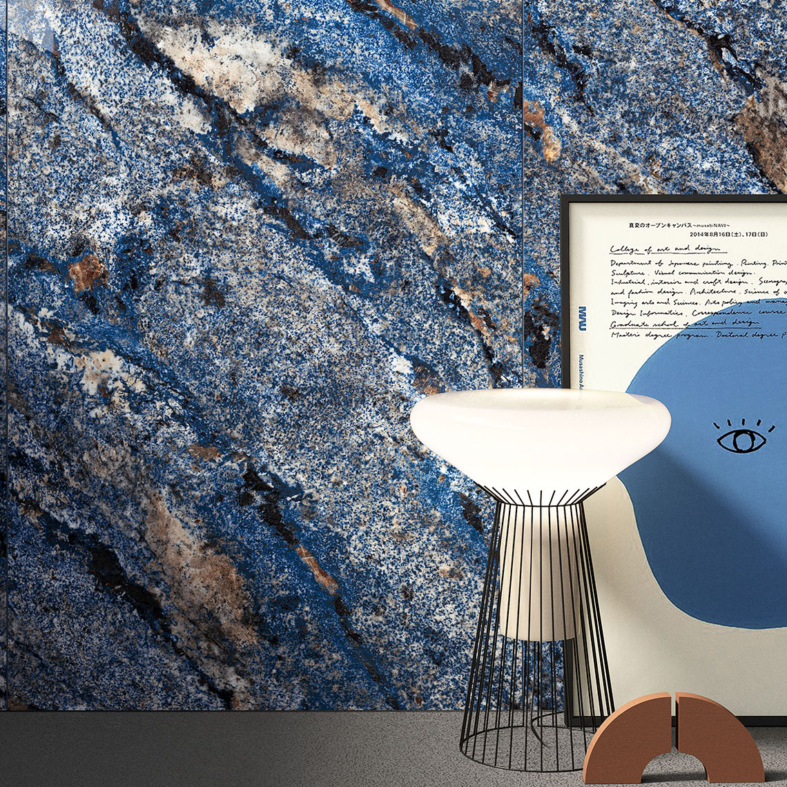
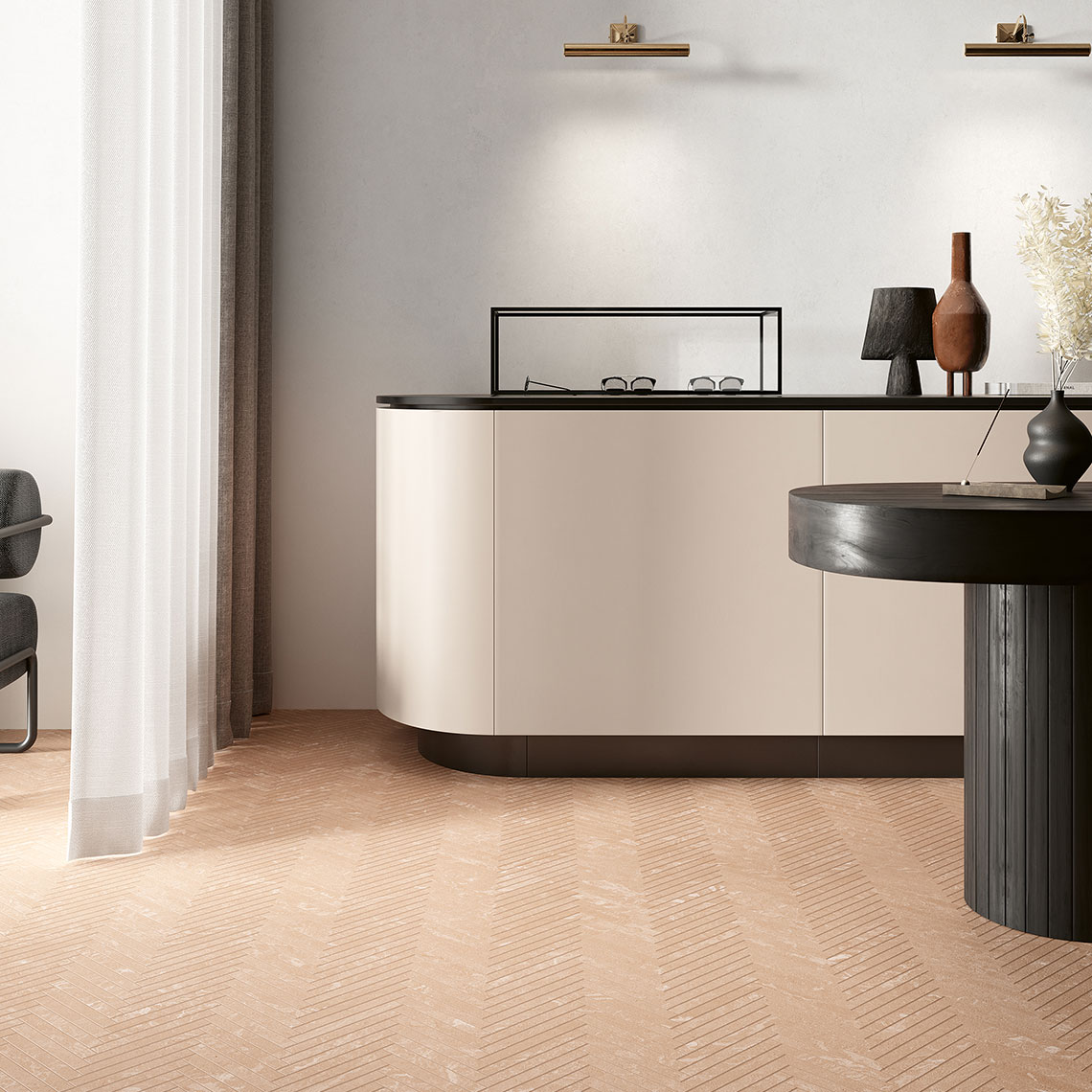
Giving colour to your home, personalising the environments that we love most with our preferred nuances, allows us to design and create settings that fully reflect our personality. Fioranese offers numerous collections with different colours and finishes, with which to enhance our environments and give new life to the spaces we live in every day. Do you want sophisticated cheerfulness? A full colour effect is achieved with Fio.Passepartout; thanks to this special collection, walls become saturated with single shades through the use of volumetric ceramic panels in porcelain stoneware. Pink, mint, blue and mango: opaque finishes that evoke timeless elegance and offer contemporary solutions and infinite combinations used on their own or in combination with other collections. There is really an embarrassment of choice. If blue is your colour, Granum offers an extremely modern and elegant nuance within the collection. The inspiration is taken from a granite of Brazilian origin: the characteristic blue of Azul Bahia. The subtle pattern and veining lend spaces a particularly refined mood. Marmorea Intensa makes it possible to use colours together with a marble effect, creating a magic equilibrium between colour and brilliance, especially in the light blue and green versions. If, instead, you love more restrained colours that create warm atmospheres, the Variegati collection, with a terracotta effect, offers a refined powder nuance which is extremely striking in its simplicity.
SHARE THE ARTICLE ON YOUR SOCIAL MEDIA PROFILES:
