The new 2021 Pantone colours reflect resilience and hope
Yellow and grey come together in an irresistible combination
Every year there is a lot of anticipation and hype to discover the colour that will characterise interior design for the next 365 days. What colour has Pantone chosen for 2021? The surprise is that Pantone didn’t just choose one colour. 2020 was one of the most difficult and challenging years we have had to face, and it deserved an equally important recovery. Therefore, Pantone chose two colours for 2021: Ultimate Grey and the vibrant Illuminating yellow! These two colours defined by Pantone join forces to complement and support each other in an irresistible chromatic mix to be discovered.

What do the two new colours mean?
Pantone wanted to communicate to the world the choice of combining two colours that are in many ways different, such as grey and yellow, but that come together to express energy, positivity and stability, all feelings and sensations that we need today more than ever. In fact, grey is the colour of stability, a rock-solid colour that represents pragmatism, strength and serenity. In 2021, however, we also need positivity, cheerfulness, and above all hope, and this is expressed by vibrant yellow. Pantone 2021 presents two independent and very different colours which can unite and support each other.
Pantone’s colour for 2021 in interior design
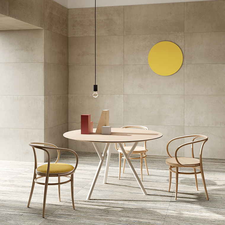
How can we use this unusual combination in the interior design of our homes? Ultimate Gray and Illuminating Yellow retain their independence and do not necessarily have to be used in equal proportions, each of the two colours can prevail over the other. Together they create an extraordinary atmosphere. The combination of grey and yellow is also ideal for designing new spaces, whether used in wall and floor coverings or décor furnishings. In fact, designers have always used both of these colours to create products with a strong yet refined and elegant character, that never goes out of style.

How can we best incorporate these colours into our home decor?
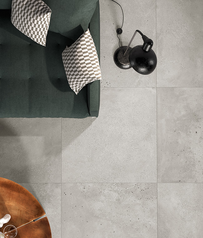
One of the easiest ways to introduce these colours in our home is with décor elements such as cushions. For example, bright yellow is a very cheerful colour and will liven up a grey couch. A children’s bedroom can be another place where these two colours can be easily incorporated. For example, yellow can be combined with furniture and accessories in shades of grey, steel and light wood. This colour scheme is sure to stimulate the imagination and energy of little ones! Grey is one of the most suitable colours to put in your bedroom because it evokes a feeling of serenity. If you have a master bedroom decorated in shades of grey, you can create a striking effect by incorporating an evocative element such as a yellow armchair to add a pop of colour without detracting from the serenity and calmness of the room.
2021 Pantone colours also in Fioranese collections
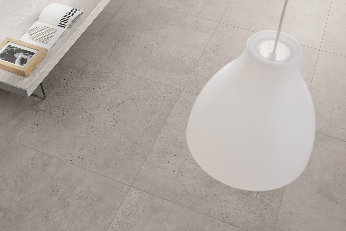
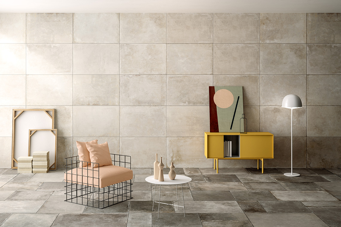
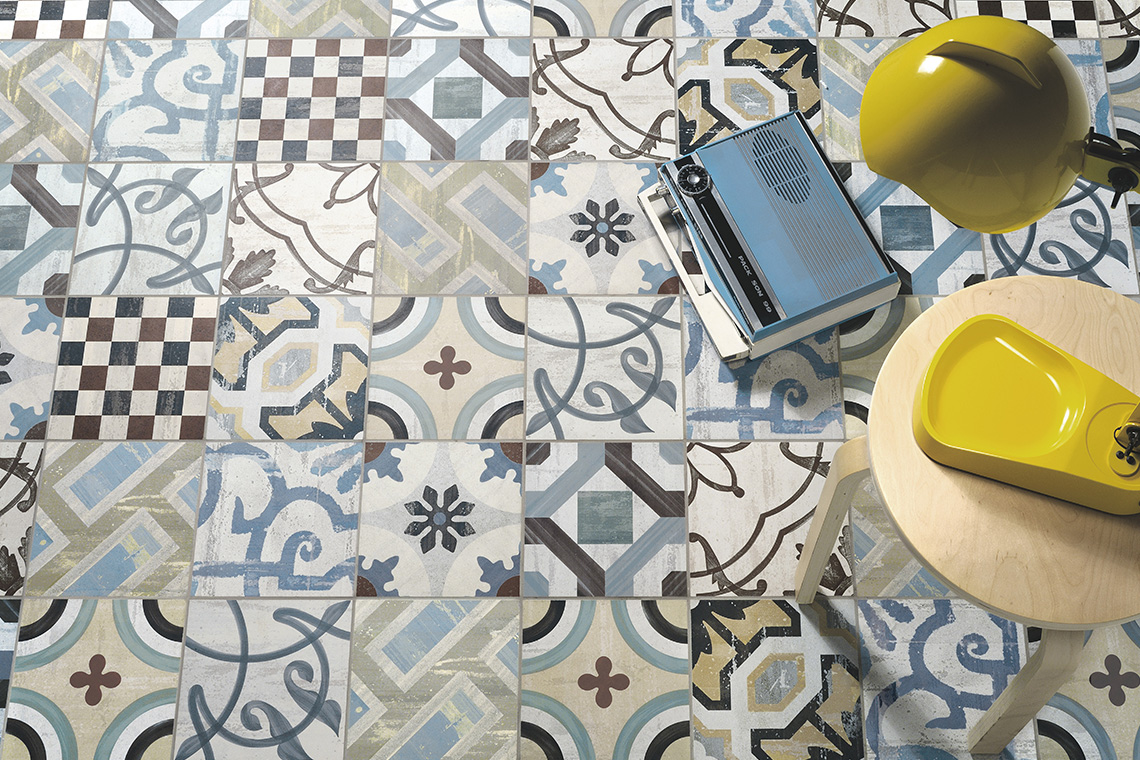
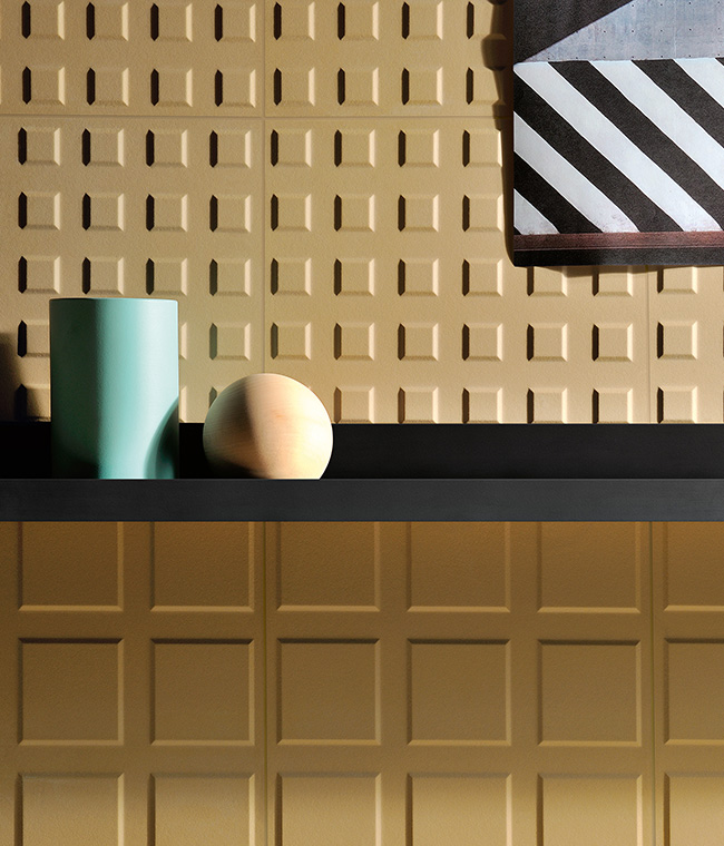
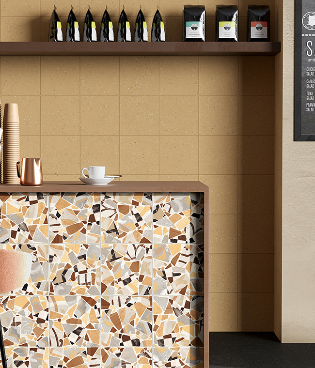
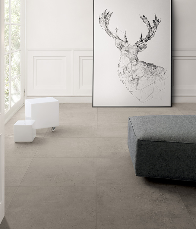
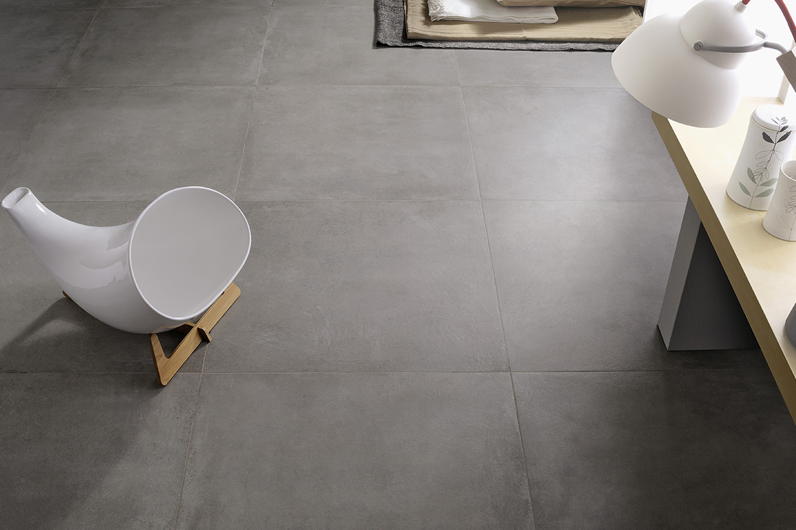
There are so many ways to use these two colours in wall and floor finishes. Fioranese has several collections that are perfect for incorporating elegant grey and touches of yellow into our homes or commercial spaces. For example, Marmorea Intensa is a new collection whose elegant textures allow different shades of grey to be used in the finishes. This collection will bring a feeling of harmony and resilience to any room and create a pleasant atmosphere. If you want something really special with a visually appealing pattern, this collection includes the Muretto 7.3×30 Vague Grey, whose elegance will surely enhance the look of any space. On the other hand, if you prefer a grey effect similar to the look of concrete, which is so modern and stylish, choose the many different solutions offered by I Cocci, Dot, Blend, Concrete and Sfrido. With these collections you can create concrete-effect floors suitable for contemporary living spaces, and perhaps use contrasting splashes of yellow for the furnishing items, such as bookcases or paintings. However, if you want to use yellow for the walls or floors, Fioranese offers collections with extremely different moods, such as Fio.Block and Cementine_Cocci. You can create cheerful and colourful graphic effects and combinations with Cementine, or more sophisticated and designer effects with Fio.Block. We are ready to bring new colours into our homes and commercial environments, and to start thinking positively and cheerfully again.
SHARE THE ARTICLE ON YOUR SOCIAL MEDIA PROFILES:
